A Guide to Color Contrast Accessibility Guidelines
Color contrast accessibility guidelines are a set of practical rules to make sure your website's text and graphics are easy for everyone to read. It’s all about picking foreground and background colors with enough of a difference between them so nobody has to squint to get your message. Think of it as a huge part of creating a welcoming and user-friendly website.
Why Good Color Contrast Welcomes Everyone
Ever tried reading light grey text on a white background? It’s a real headache, right? That frustrating feeling is exactly what we’re tackling when we talk about color contrast.
Think of your website as your digital storefront here in Kelowna. You want every single person who walks through that virtual door to feel comfortable, find what they need, and have a great experience. Making poor color choices is like slamming that door shut for a surprisingly large number of people.

The color contrast accessibility guidelines aren't just technical jargon; they’re a practical roadmap to help you welcome more visitors. They ensure your text and important graphics are clear and legible for everyone, including folks with visual impairments like low vision or color blindness.
More Than Just Pretty Colors
It’s so easy to get wrapped up in making a website look beautiful. But a truly great design is about both looks and function. When potential customers from Vernon to Penticton visit your site, they're looking for information. If they can't read it easily, they’ll simply click away.
Let's break down why this is such a big deal for your business.
Why Color Contrast Matters at a Glance
For any local business, making a good first impression online is everything. Here's a quick summary of how getting your colors right helps you do just that.
| Benefit | What It Means for Your Business |
|---|---|
| Wider Audience Reach | You connect with more potential customers, including the 1 in 12 men and 1 in 200 women with color vision deficiency. |
| Better User Experience | Everyone finds your site easier to read, even in tricky situations like reading on a phone in bright sunlight. |
| Increased Trust & Credibility | An accessible site shows you care about all your customers, which signals professionalism and boosts your reputation. |
| Improved SEO | Search engines favor user-friendly sites. Good accessibility is a quality signal that can positively influence your rankings. |
In short, thoughtful color choices are a fundamental part of providing excellent customer service online.
For a small business in the Okanagan, every single visitor counts. Creating a website that’s easy to use is a core part of great customer service that directly impacts your bottom line.
Getting this right can make a world of difference. It transforms your website from a simple online brochure into a genuinely useful tool that helps you connect with more customers, build a stronger reputation, and grow your business. If you’re not sure where to start, getting some expert help can be the perfect first step toward a more welcoming website.
Understanding the Magic Numbers of Contrast
Let's get into the specifics. Don't worry, we'll skip the dense technical jargon. The gold standard for web accessibility is the Web Content Accessibility Guidelines, or WCAG. Think of it as a proven recipe for creating a better, more inclusive user experience.
Just like any good recipe, WCAG gives us a few key numbers to follow. These are called "contrast ratios," which is really just a way to measure the difference in brightness between your text color and its background. For most of the text on your website—the paragraphs, the descriptions, the stuff people actually read—the magic number to hit is a 4.5:1 ratio.
What Do These Ratios Actually Mean?
A ratio of 4.5:1 is the sweet spot that ensures text is sharp and readable for people with common visual impairments, like color blindness. Honestly, it just makes for a more comfortable reading experience for everyone. It prevents that frustrating squint we've all done when faced with faint, washed-out text.
But what about bigger text, like the headlines and subheadings you use to structure your pages?
Since larger text is naturally easier to read, the guidelines give us a bit more flexibility. For any text that’s considered "large" (we'll get into the exact sizes later), you only need to hit a contrast ratio of 3:1. This opens up more creative possibilities with your brand palette while making sure your content stays perfectly legible.
This is a core part of our philosophy when building accessible websites for our partners.
This screenshot from the official WCAG guide shows the exact requirements we’ve just covered. The main thing to remember is that Level AA is the widely accepted standard for most websites. That makes those 4.5:1 and 3:1 ratios the most important ones for you to know.
Why This Matters in Canada
Getting color contrast right is a legal expectation here at home. In Canada, accessibility guidelines are woven into federal and provincial laws that have completely reshaped how businesses approach their online presence. The Accessible Canada Act (ACA), for instance, aims to create a barrier-free Canada by 2040. This means federally regulated industries must proactively remove digital barriers—and low-contrast text is a big one.
For businesses operating right here in B.C., meeting these standards is fundamental to creating an inclusive online space. Provincial accessibility laws, including those in British Columbia, typically align with WCAG 2.0/2.1 Level AA. That means the 4.5:1 ratio for normal text and 3:1 for large text are the numbers to live by.
The Government of British Columbia, for example, explicitly states that all public-facing websites must meet these minimum contrast levels. The message is clear: good contrast is no longer optional for doing business online in the Okanagan and across the country. You're being a responsible business that welcomes every potential customer, and it keeps you aligned with important regulations without needing a law degree to understand them.
Simple Tools to Check Your Website Colors
So, how do you actually know if your website’s colors are up to snuff? The great news is you don’t need to be a designer or a tech whiz to figure this out. Honestly, some of my favorite tools for checking color contrast are completely free and incredibly simple to use.
It’s as easy as grabbing the color codes for your text and its background, popping them into a checker, and getting an instant result. Think of it like a spell-checker, but for your website's colors. It’s all about empowering you to take a quick peek under the hood of your site.
Our Go-To Contrast Checkers
There are plenty of options out there, but a few stand out for being straightforward and reliable. You can find them with a quick search, and they all work pretty much the same way.
-
WebAIM Contrast Checker: This is probably the most popular one, and for good reason. You just enter your foreground (text) and background color codes.
-
Colour Contrast Analyser (CCA): This is a downloadable app for your computer that includes a handy eyedropper tool, so you can click on any color on your screen to test it.
-
Browser DevTools: If you’re feeling a little more adventurous, both Chrome and Firefox have built-in tools for developers that show contrast ratios right on your live site.
It's amazing how a five-minute check can uncover issues that might be turning away potential customers. We once helped a local Kelowna real estate agent who realized the text on their property listings was failing contrast tests—a quick color tweak made a huge difference in how long people stayed on the page.
How to Use a Contrast Checker
Let’s walk through the WebAIM tool. You’ll see two boxes: one for the foreground color and one for the background. All you need to do is paste the hex codes—the six-digit codes that represent specific colors, like #FFFFFF for white—into the appropriate boxes.
The tool instantly spits out a contrast ratio and tells you if you pass or fail the WCAG AA and AAA standards for both normal and large text.
It gives you a very clear 'Pass' or 'Fail' for each level. As you adjust the colors, you can see the results update in real-time, which makes finding a compliant alternative incredibly fast. Many of these tools even provide a slider to help you adjust the lightness or darkness until you find a shade that passes.
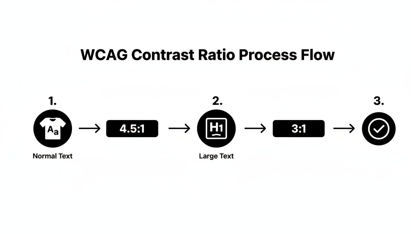
This simple process flow shows the two key ratios we're aiming for. Remembering that normal text needs a 4.5:1 ratio and large text needs a 3:1 ratio will help you quickly interpret the results from any checker you use.
If you see a "Fail," don't panic! It's usually a quick fix. If you get stuck, working with a partner can help you get things sorted out fast.
Putting Good Contrast into Practice on Your Site
Knowing the rules is one thing, but actually putting them to work on your website is what makes a real difference. This is where the rubber meets the road… or, I guess, where the pixels meet the screen. It’s all about making smart, practical choices that look great and work for everyone.
This is especially true for businesses here in the Okanagan where visuals are everything. A real estate agent in Penticton needs their property listings to pop, and a tourism operator in Vernon needs their tour descriptions to be crystal clear. Good contrast helps you do both without sacrificing your brand’s beautiful aesthetic.
Start with an Accessible Brand Palette
The easiest way to get contrast right is to build it into your brand colors from day one. When you’re choosing colors for your logo and branding, think about how they’ll actually work together on a screen. Will your primary brand color work as a button background with white text? Does your secondary color have enough contrast against a light grey background for body copy?
Answering these questions early on saves a ton of headaches later. It’s a core part of building a strong user interface design that feels effortless for your visitors. For a deeper dive, you can check out our guide on user interface design and see how it shapes the entire customer experience.
Here in British Columbia, we have clear guidance that helps marketing teams make smart decisions. The Government of British Columbia’s own digital toolkit specifies that to meet accessibility rules, the contrast ratio between text and its background must be at least 4.5:1 for normal text. This lines up perfectly with the WCAG standards we've been discussing. While they note that logos don't technically have a minimum contrast rule, they wisely warn that logo colors often set the tone for the entire brand. It's best to start with a high-contrast palette from the get-go. You can read more about B.C.'s digital accessibility toolkit for the full details.
Tackle Text Over Images Carefully
One of the biggest design challenges we see is putting text directly over images. It's a classic look for hero banners and featured sections, but it can quickly turn into a nightmare for readability. The colors within an image can vary wildly, making it impossible for a single text color to have enough contrast across the entire picture.
So, how do you fix it without ditching your beautiful photos?
-
Add a Color Overlay: Placing a semi-transparent dark overlay between the image and the text is a simple, elegant solution. A 50-70% black overlay can create a consistent, dark background that makes white text stand out beautifully.
-
Use a Text Shadow: A subtle drop shadow on the text can help it separate from a busy background image. Just be careful with this one—a heavy shadow can make text look blurry and defeat the purpose.
-
Place Text in a Solid Box: You can also place your headline or call-to-action inside a solid-colored box that sits on top of the image. This guarantees perfect contrast, every time.
We recently worked with an Okanagan winery whose homepage featured gorgeous vineyard photos with white text directly on top. On some screens, it was perfect; on others, the text just disappeared into the bright sky. Adding a subtle, dark gradient overlay made the text perfectly readable without losing the photo's impact.
Don't Forget the Small Stuff
Finally, pay attention to the little interactive elements on your site. These are the details that create a smooth, welcoming experience for every single user.
-
Buttons: Your call-to-action buttons absolutely need to be easy to see. The text on the button should have a 4.5:1 contrast ratio with the button's background color.
-
Links: If you aren't underlining links within your paragraphs, their color needs to have a 3:1 contrast ratio with the surrounding text and a 4.5:1 ratio with the background. Honestly, it’s just easier to underline them.
-
Form Fields: The borders of your input fields (like name, email, etc.) need a 3:1 contrast ratio against the background so people can tell where to click and type. Placeholder text inside the field needs to pass the 4.5:1 ratio, too.
These small things really add up. When every element on your page is clear and easy to interact with, you’re telling your customers that you value their time and attention.
How Accessibility Builds a Stronger Business
Let's bring this all home. It's easy to get lost in the technical side of things, but the reason these rules and ratios matter is surprisingly simple. When you build a more accessible website, you're fundamentally showing your community that you care.
Making your site easy for everyone to use means you're opening your doors wider. You're welcoming customers who might have been unintentionally shut out before. This is where thoughtful design meets smart business—it's a genuine win-win.
Turning Good Intentions into Good Business
A website that follows color contrast guidelines forges real connections. Imagine a potential client in the Okanagan trying to book one of your services. If they can easily read your descriptions and understand your pricing without a struggle, you've already started to build trust.
That seamless, frustration-free experience is what converts a casual browser into a loyal customer. It sends a subtle message that you've considered their needs, and that kind of care doesn't go unnoticed. Seemingly small tweaks to your color palette can lead to big gains in user engagement and, ultimately, your bottom line.
We're talking about a significant slice of the Canadian population who might otherwise find it difficult to use your site. A 2023 survey from Statistics Canada drives this point home, revealing that about 5.2 million Canadians report difficulty with print material, often stemming from issues like poor contrast. For any business, that's millions of people who could become customers if your website is clear and legible. You can discover more about these findings from Statistics Canada.
Real-World Wins from Small Changes
We've seen the powerful impact of these changes firsthand. We once worked with a local non-profit in West Kelowna that had a stylish, light-blue donation button on a white background. It looked elegant, but their analytics told a different story: people weren't clicking it.
We did a quick audit and switched the button to a high-contrast dark blue that easily passed WCAG standards. The result? In the month that followed, their online donations jumped by over 30%. A simple color change made it easier for supporters to act, directly boosting their mission.
This isn't just a one-off story. Time and again, we see that removing barriers creates opportunities. A clear, high-contrast website improves the experience for every single visitor—whether they have a visual impairment or are just trying to read your site on a sunny day in the Okanagan. At its core, great graphic design for the web is about providing clarity and guiding people to act.
Building an accessible website is one of the most powerful ways to expand your audience and enhance your brand's reputation. It shows you're a professional, thoughtful, and inclusive business—a message that resonates with everyone.
What's the Next Step to a More Welcoming Website?
Feeling a little overwhelmed by all this? That's completely normal.
We've just covered a lot of ground on color contrast accessibility guidelines, and the hardest part is often just figuring out where to begin. It can easily feel like one more giant task piled onto an already overflowing plate.
But here's the most important thing to remember: you don’t need to do a massive brand overhaul overnight. Making small, thoughtful changes to your website’s colors can make a huge difference for your visitors and show them you genuinely care about their experience.
Start Small, Build Momentum
The best way to get started is to take one simple step. Grab one of the free tools we mentioned earlier and just check a few key pages on your site. Don't feel pressured to test every single corner right now.
Instead, focus on the pages that really matter to your business:
-
Your Homepage: This is your digital front door.
-
Your Services or Products Page: This is where customers make the decision to buy.
-
Your Contact Page: Make sure it’s effortless for everyone to get in touch.
Just run a quick check on the main text and buttons on these pages. This small audit alone will give you a clear, manageable starting point. You might find everything is already in great shape… or you might find a few quick fixes that make a big impact.
The goal is making steady, meaningful progress toward an inclusive website that works better for every single person who visits.
If you do find some issues and aren't quite sure how to fix them without throwing your branding out of whack, that’s where a good partner comes in. Sometimes, all you need is an expert eye to spot the simple solutions you might have overlooked.
At Navigator, we've been helping Okanagan businesses build beautiful, effective, and accessible websites since 1993. We believe in getting the details right because we know they add up to a powerful customer experience. We’ve seen firsthand how small accessibility improvements can lead to big business results for our partners.
If you’d like some help making sure your site is welcoming every potential customer, we’re here for you. Building a better website is a journey, and you don't have to go it alone. Let's connect and talk about your next steps.
Frequently Asked Questions About Color Contrast
You’ve made it this far, which is fantastic! We've covered a lot of ground, and it's completely normal to still have a few questions buzzing around. Let's tackle some of the most common things people ask us about color contrast.
What's the Single Most Important Contrast Ratio to Remember?
If you only memorize one number, make it 4.5:1. This is the magic number for WCAG AA compliance for normal-sized text.
This is the ratio that covers the vast majority of the content on your website—all those paragraphs, service descriptions, and blog posts. Honestly, if you can get this one right across your site, you’ve already solved most of the common contrast problems out there and made a huge difference for your readers.
Do My Logo and Brand Colors Have to Follow These Rules?
That's a great question, and the technical answer is no. According to WCAG, text that's part of a logo or official brand name has no minimum contrast requirement.
However—and this is a big "however"—your logo's colors often set the stage for your entire brand palette. If your main brand color doesn't pass contrast tests against white or black, you're just creating headaches for yourself down the road when you try to use it for buttons, links, and headings. It’s always a smart move to pick brand colors that are beautiful and accessible right from the start.
Is It Okay to Use Light Grey Text for a Softer Look?
We hear this one all the time. Designers and business owners often love the elegant, minimalist vibe of light grey text. But this is one of the most common accessibility traps we see.
More often than not, that soft grey text on a white background fails the 4.5:1 contrast test, making it genuinely difficult for many people to read. The good news is you can still get that soft, modern aesthetic without shutting people out.
A darker charcoal grey (something like #595959) often provides a similar sophisticated feel while easily passing accessibility standards. You don't have to choose between a beautiful design and an inclusive website; you can absolutely have both.
What About Text on Buttons? Does It Follow the Same Rules?
Yes, it absolutely does! The text inside your buttons needs to have at least a 4.5:1 contrast ratio against the button's background color. Think about your most important call-to-action, like "Book a Tour" for a Kelowna winery or "View Listings" for a Penticton realtor. If that text isn't crystal clear, you could be losing business.
But it doesn't stop there. The button itself also needs to stand out from its surroundings. The newer WCAG 2.1 guidelines recommend that the button's border or background has a 3:1 contrast ratio against the page background, making sure people can clearly identify the entire clickable area.
Getting these little details right can feel a bit fussy, but it’s exactly this kind of thoughtful work that separates a good website from a truly great one.
If your website isn't pulling its weight and you're ready to turn it into your best salesperson, the team at Navigator Multimedia can help. We build sites that are as effective as they are beautiful. Contact us to get started.