How to Reduce Image File Size Without Losing Quality
Let's talk about something that might be quietly driving customers away from your website: those beautiful, high-resolution images. It's a classic problem, and you're not alone if you've run into it. You’ve got stunning photos of your products or maybe some gorgeous shots of a recent project, but they’re taking an eternity to load.
It feels like a small technical thing, but it’s a business problem. When someone lands on your page, you have only a few precious seconds to grab their attention. If they're met with a blank space where an image should be… well, their patience evaporates. Quickly.
We've all been there. You click a link, the little wheel spins, and you're gone. If your site feels sluggish, visitors will assume your business is too, and they'll bounce right over to someone with a zippier website.
The Hidden Cost of Large Images
It’s an easy mistake to make when you're busy running things. You get a folder of incredible photos back from a photographer, and your first instinct is to upload them directly. The catch is that these images are usually massive—they're built for high-quality printing, not for the web.
When those heavy files go live on your site, a few things happen:
Your bounce rate skyrockets. The bounce rate measures how many people leave after seeing just one page. Slow-loading images are one of the biggest reasons people get fed up and leave before your content even has a chance to appear.
Your Google ranking can take a hit. Search engines are obsessed with user experience, and site speed is a massive factor. A slow website signals a poor experience to Google, which can push you down in search results. Suddenly, fewer people are finding your business.
You lose mobile users. Well over half of all web traffic now comes from smartphones. These users are often on less-than-perfect data connections and have zero patience for lag. A site that isn’t optimized for speed is essentially invisible to this huge audience.
We once worked with a local tourism company whose booking page took nearly ten seconds to load, all because of one huge, unoptimized banner image. After we properly compressed it, the page loaded in under two seconds. The result? They saw a 40% increase in online bookings in the first month alone. That’s the real-world impact of speed.
Getting this right is about creating a seamless, professional experience for every visitor. By turning those beautiful but slow photos into lean, web-friendly assets, you make your website a much more effective tool for your business.
To dig deeper into this, you can learn more about how speed impacts your bottom line by checking out our guide on understanding website speed.
Choosing the Right Image Format for the Job
Ever feel like you’re just guessing when you save an image? PNG, JPEG, something else entirely… you're not alone. It can feel a bit technical, but picking the right file type is one of the easiest ways to start shrinking image file sizes without sacrificing quality.
Think of it like this: you wouldn't use a hammer to drive in a screw. Image formats work the same way. Each one is a tool designed for a specific job, and using the right one from the start saves a ton of headaches.
This simple decision has a huge impact on how fast your website loads. It's a classic fork-in-the-road moment for your site's performance.
As you can see, a slow-loading image often means a visitor will simply give up and leave, whereas a fast-loading one keeps them engaged. It's a small detail that makes a massive difference in keeping potential customers on your site.
Your Go-To Image Formats Explained
Let’s break down the main players without getting bogged down in jargon. Honestly, getting to know these few formats will cover about 99% of what you'll ever need for your website.
Here's a simple breakdown of the most common image file types and when to use each one for your business website.
A Quick Guide to Common Image Formats
| File Format | Best Used For | Key Feature |
|---|---|---|
| JPEG | Photographs, complex images with many colours and gradients. | Great at compressing photos into small file sizes. |
| PNG | Logos, icons, graphics with sharp lines, and text. | Supports transparent backgrounds, which is essential for branding. |
| WebP | A modern replacement for both JPEGs and PNGs. | Offers much smaller file sizes than older formats with great quality. |
| AVIF | The newest format offering the best compression available. | Even smaller files than WebP, but browser support is still growing. |
This table gives you a cheat sheet, but let's quickly dig into why these matter.
JPEG (or JPG): Your Best Friend for Photos
This is the absolute workhorse for almost any photograph. JPEGs are brilliant at handling images with lots of colours and subtle gradients—think of a photo of a beautiful Okanagan vineyard or a client project in West Kelowna. They use a clever compression method that dramatically reduces file sizes while maintaining excellent quality for these complex images.
Use JPEG for: Product photos, hero images, portfolio shots, and any real-world photography.
Don't use JPEG for: Logos or graphics with sharp lines and text. The compression can make them look a bit fuzzy around the edges.
PNG: The Choice for Crisp Graphics
PNGs are fantastic for anything that isn't a photograph. Their biggest superpower is transparency. If you have a logo that needs to sit on a coloured background without a clunky white box around it, PNG is your hero. They keep lines sharp and text crisp, which is perfect for brand assets.
Use PNG for: Logos, icons, illustrations, and any graphic where you need a transparent background.
Good to know: PNG files are usually larger than JPEGs, so only use them when you truly need that transparency or razor-sharp detail.
The New Kids on the Block: WebP and AVIF
You might be hearing more about formats like WebP and AVIF. Think of WebP as a modern, multi-talented format that combines the best of JPEG and PNG. It can handle both complex photos and graphics with transparency, all while creating significantly smaller file sizes. AVIF takes this a step further, offering even better compression.
Switching from a JPEG to a modern format like WebP can result in an average 30% file size reduction with no visible difference in quality. For small businesses in Canada managing e-commerce sites, this means faster pages and happier customers.
So, should you be using these new formats? The short answer is yes, when you can! Most modern browsers support them, and they offer a fantastic balance of quality and performance. If you're working with a web partner, they can help set up your site to serve WebP or AVIF images automatically to browsers that can handle them.
Understanding these formats is a huge first step in mastering your website's visuals. It’s a foundational piece of the puzzle, just like a strong logo is foundational to your brand. If you're looking for help with your visual identity, you might be interested in our approach to graphic design for the web.
Choosing the right format sets the stage for everything else. Once you've got this down, you’re well on your way to a faster, more effective website that your customers will love using.
Getting Your Image Dimensions and Resolution Right
Let's talk about image size—the kind you measure in pixels. One of the most common mistakes I see is someone uploading a massive photo straight from a professional camera. It might look absolutely stunning, but it’s like trying to fit a semi-truck into a regular parking spot in downtown Vernon. It's just way too big for the web.
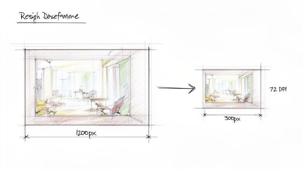
Before you even think about compressing an image, you have to get its dimensions right. This single step—resizing your image before you upload it—will slash your file size more than almost anything else.
Finding the Perfect Dimensions for Your Website
So, how do you know what size to make your image? The goal is simple: match the image dimensions to the largest size it will ever be displayed on your website.
Think about the structure of your site. If your blog post content fills the main column of the page, that column has a maximum width. Let’s say it's 800 pixels wide. Uploading a 4000-pixel-wide image into that space is complete overkill. Your visitor's browser has to download that huge file and then do the work of shrinking it down to fit the 800-pixel space anyway.
A great little trick to figure this out is to use your browser's "Inspect" tool. Just right-click on the area of your website where the image will go and choose "Inspect." As you hover over the code, a little box will pop up showing you the exact dimensions of that container. That gives you a perfect target to aim for.
Based on our experience building sites for clients, here are some solid guidelines:
Full-width hero or banner images: These are the big, beautiful images at the top of a page. Aim for around 1920 pixels wide.
Standard blog post or page images: For an image inside the main content area, 1200 pixels wide is a safe and generous bet.
Smaller thumbnail images: For things like product galleries or "related posts," you can often go as small as 400-600 pixels wide.
By resizing images to fit their containers before uploading, you're doing the heavy lifting for your visitors' browsers. This simple step ensures the browser doesn't download unnecessary pixels, which is a massive win for your page speed.
Demystifying Resolution for the Web
Now, let's quickly touch on resolution, often measured in DPI (dots per inch) or PPI (pixels per inch). If you've ever worked with a printer, you've probably heard the term 300 DPI. That's the gold standard for high-quality printed materials.
Here’s the thing… that number means next to nothing for the web.
Screens display images based on their pixel dimensions (width and height), not DPI. For digital displays, the standard has long been 72 PPI. While modern design tools might default to higher numbers, saving your images at 72 PPI is a perfectly fine and effective practice for web use.
Saving an image at 300 DPI instead of a web-friendly resolution dramatically increases the file size with absolutely zero visible benefit on a screen. In fact, a lower resolution can make a huge difference. For example, even official guidance from Immigration, Refugees and Citizenship Canada suggests scanning documents at a lower resolution like 96 DPI to greatly reduce image file sizes. You can discover more about their digital document tips here.
So, when you're saving images for your site, just remember these two things: resize the pixel dimensions to fit your website's layout and set the resolution to 72 PPI. Getting this foundation right makes every other optimization step so much more effective. If you’re feeling a bit lost in the technical details, having a partner to handle it for you can be a huge relief. You can always reach out to us to see how we can help.
Choosing the Right Image Compression Tool
Alright, you’ve picked the best format and resized your image to the perfect dimensions. Now it’s time for the final touch: compression. This is where we smartly strip out unnecessary data to make that file size as small as possible without wrecking the quality.
Think of it like packing a suitcase for a trip. You can just toss everything in, but it’ll be a heavy, bulky mess. Or, you can fold and roll everything neatly, fitting the same amount of stuff into a much lighter, more compact bag. Image compression tools are your expert packers.
There are a ton of options out there, so let's cut through the noise and look at the simple, effective tools we use every day.
Lossy vs. Lossless: What's the Difference?
Before we dive into the tools themselves, you need to understand the two main approaches to compression. This little bit of knowledge will help you make the right call for each image.
Lossless Compression: This method shrinks the file size by removing non-essential metadata—things like the camera model or software used to edit the photo. The image quality remains 100% identical to the original because no pixel data is touched. It’s perfect for technical diagrams, icons, or logos where every detail has to be razor-sharp. The file size reduction is usually more modest, though.
Lossy Compression: This is where the real magic happens for web photos. Lossy compression intelligently removes bits of image data that the human eye is unlikely to notice. This results in a massive reduction in file size, with a tiny, often imperceptible, drop in quality. For almost every photo on your website, this is the way to go.
Don't let the word "lossy" scare you. A good tool gives you precise control. Setting the quality to around 80-90% often slashes the file size in half with zero visible difference. It’s the secret behind stunning websites that still load in a flash.
Fast and Free: Online Compression Tools
For most day-to-day tasks, online tools are a fantastic choice. They're quick, free, and couldn't be simpler—just drag, drop, and download. No software installation needed.
These are your best friends when you're adding a few images to a new blog post or updating a product page. Here are a couple of our go-to's:
TinyPNG: The name is a bit of a misnomer because it works just as brilliantly on JPEGs. It uses incredibly smart lossy algorithms to strike the perfect balance between tiny file sizes and great quality. It’s our first stop for a quick, reliable fix.
Squoosh: This tool from Google is a powerhouse that runs right in your browser. Its best feature is the live preview slider. You can drag the quality setting back and forth and see the visual impact—and the new file size—in real-time. It’s perfect for dialing in that sweet spot.
These tools are ideal for a local business owner who just needs to get a few photos ready for their website without getting bogged down in technical details.
More Power and Control: Desktop Software
If you're optimizing images on a regular basis or need to tackle a whole folder at once, desktop software is the way to go. You get way more control over the settings, and you're not at the mercy of your internet connection.
One of our favourites is ImageOptim (for Mac). It's a free, drag-and-drop app that uses a whole suite of the best optimization tools under the hood to wring every last kilobyte out of your images. It strips out hidden junk data and can be configured for powerful lossy compression. For Windows users, RIOT (Radical Image Optimization Tool) is an excellent and very similar alternative.
The killer feature of desktop apps is batch processing. Just finished a photoshoot for a new real estate listing? Instead of compressing 50 photos one by one online, you can drag the entire folder into the app and let it do its thing. It’s an absolute game-changer for workflow efficiency.
Whether you opt for a simple online tool or a more powerful desktop app, making compression a non-negotiable step in your workflow is one of the single biggest improvements you can make to your website's performance. It creates a better experience for every visitor and gives you a leg up with Google.
If keeping track of all these technical details feels like a distraction from actually running your business, that's where a web partner can make all the difference. We sweat the small stuff so you can focus on what you do best. If you'd like to see how we can help, feel free to get in touch with us.
Putting Image Optimization on Autopilot for WordPress and Shopify
Let's be real: manually resizing and compressing every single photo you upload is a massive time sink. If you're running an e-commerce store with hundreds of products or a real estate site showcasing properties across the Okanagan, it's just not a practical workflow. The good news? You don't have to.
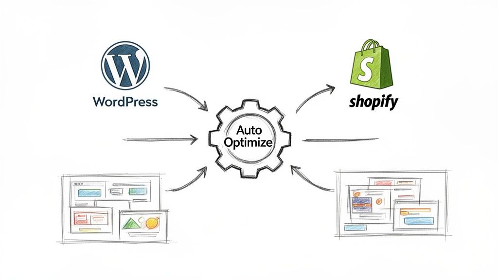
If your website is built on a platform like WordPress or Shopify, you can automate nearly all of this work. Think of it as having a digital assistant working behind the scenes, ensuring every image is perfectly web-ready the moment you upload it.
This not only saves a huge amount of time but, more importantly, keeps your site consistently fast.
The Magic of Plugins for WordPress Sites
For anyone using WordPress, plugins are the secret weapon for effortless image optimization. Instead of you having to remember to compress every photo, these tools do it for you automatically. The moment you upload a new image to your Media Library, the plugin intercepts it, shrinks it down, and replaces the original with a lean, optimized version.
It's a genuine “set it and forget it” solution. Here are a couple of the trusted tools we often set up for our clients:
ShortPixel Image Optimizer: This one is a real powerhouse. It offers both lossy and lossless compression, can convert images to modern formats like WebP or AVIF, and even has a feature to go back and optimize all the images you’ve already uploaded.
Imagify: Created by the same team behind a popular caching plugin, Imagify is another fantastic option. It’s known for its user-friendly interface and offers different compression levels, so you can decide just how aggressive you want to be with file size reduction.
Most of these plugins operate on a credit-based system. You usually get a set number of free optimizations each month (often around 100, which is plenty for many small businesses), with affordable plans if you need more. It’s a small investment for a major improvement in site speed and workflow.
Must-Have Apps for Shopify Store Owners
Shopify has its own rich ecosystem of apps that work in a very similar way. For anyone running an online store where product photos are absolutely critical, automating this process is non-negotiable. A fast-loading product page can easily be the difference between a sale and a lost customer.
Just like with WordPress, you install an app, configure a few settings, and let it handle the heavy lifting. Our go-to recommendations include:
Crush.pics: This is one of the most popular and reliable image optimization apps on the Shopify App Store. It provides multiple compression methods and can even help with renaming your image files for better SEO—a nice two-for-one benefit.
Image Optimizer by LoyaltyHarbour: Another excellent choice that provides automatic compression for all your product, collection, and blog post images. It’s known for being easy to set up and very effective right out of the box.
Setting up these tools is usually straightforward, but tweaking the configuration to get it just right can make a huge difference. You're aiming for that perfect balance where your images are as small as possible but still look incredibly sharp to your customers. E-commerce success hinges on these details, and Shopify’s own tools can help you keep an eye on performance. For more on that, you might find our guide on Shopify's store speed report helpful.
If this all feels like one more technical task on an already-full plate, that's completely understandable. Having an expert partner set it all up correctly can be a game-changer, giving you peace of mind that your site is always running at its peak. If you'd like a hand getting this sorted, we're always here to chat about the next steps.
Common Questions About Image Optimization
We get asked about image optimization all the time, so I’ve pulled together a few of the most frequent questions we hear from business owners here in Kelowna and across the Okanagan.
Think of this as a quick FAQ to clear up those last few things you might be wondering about. Getting these details right will make you feel a lot more confident managing your website’s images and, ultimately, its performance.
What Is the Best File Size for Web Images?
This is easily the number one question we get, and the honest answer is: there's no single magic number. It really comes down to finding the right balance for each specific image you're using.
A great rule of thumb for most images on your site—like photos in a blog post or product shots on an e-commerce page—is to aim for under 150 KB. At that size, they’ll look fantastic and load in a flash.
For those big, beautiful, full-screen "hero" images at the top of a page, you'll naturally need a bit more data. In those cases, you might push up to 500 KB, but even then, the goal is always to get the file as small as possible without it looking muddy or compressed.
The key is finding that sweet spot where your images look sharp and professional, but they also load quickly for every single visitor—whether they're on a high-speed connection in Pentton or using spotty mobile data on the go.
Will Reducing Image File Size Make My Photos Look Bad?
Not if you do it correctly! This is the whole point of smart image optimization. The fear of ending up with blurry, pixelated photos is completely valid, but modern tools and techniques are designed to prevent that exact problem.
When you use "lossless" or intelligent "lossy" compression, you aren't actually degrading the visible quality of the photo. These methods work by cleverly stripping out hidden, unnecessary data—things like camera settings baked into the file or extra colour information that the human eye can't perceive anyway.
Combine that with resizing your images to the proper dimensions before you upload them, and you can slash the file size dramatically while your photos stay looking crisp and clear. It’s a true win-win.
How Do I Know What Dimensions to Make My Images?
This is a fantastic question because uploading an image that's way too big is one of the most common performance killers we see. A simple and powerful starting point is to use your browser's built-in "Inspect" tool.
It might sound a bit technical, but it's actually pretty straightforward:
Navigate to the page on your site where the image will eventually live.
Right-click on the area or container where you want to place the image.
Choose "Inspect" from the pop-up menu.
As you move your mouse over the different lines of code, you’ll see a small overlay on the screen showing the dimensions of that container in pixels (for example, 800px by 500px).
This gives you a perfect target to aim for. You can make your image slightly larger than that number to ensure it looks sharp on high-resolution screens, but don't go overboard. For a standard full-width blog post image, a width of around 1200px is usually a safe and effective size.
Can I Optimize Images That Are Already on My Website?
Absolutely! It’s never too late to go back and clean up your media library to give your site speed a welcome boost. If your website is built on a platform like WordPress, there are brilliant plugins made just for this task.
These tools can scan your entire library of uploaded images and automatically compress them in bulk. It’s a phenomenal way to improve your site’s performance without having to manually download, optimize, and re-upload every single photo you’ve ever added.
It's one of those maintenance tasks that gives you a huge return for a relatively small amount of effort. If the thought of tackling this yourself feels overwhelming, it's a perfect job to hand off to a web partner who can get it done for you quickly and correctly.
Optimizing your images is a game-changer for your website's speed and the experience you provide to your visitors. If you’d rather focus on running your business than wrestling with pixels and plugins, the team at Navigator Multimedia can help turn your website into your hardest-working salesperson. Feel free to contact us to get a free performance audit and see how we can help.