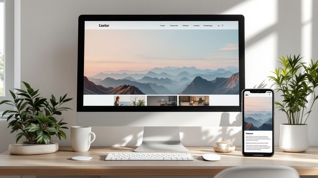
What Is Responsive Web Design? A Guide for Okanagan Businesses
Let's start with a simple idea. Imagine your website is like water. If you pour it into a tall glass (a desktop monitor), a wide bowl (a tablet), or a small cup (a smartphone), it just… fits. That’s the heart of responsive web design. It’s the art and science of building one single website that automatically adapts to look and work perfectly on any screen.
So, What is Responsive Web Design, Really?
Ever landed on a website with your phone and had to pinch, zoom, and scroll sideways just to read a single sentence? It’s an instant turn-off. Most of us just hit the back button and find another site. That frustrating experience is exactly what responsive web design fixes.
It's a way of building websites so that your content looks fantastic and is easy to use, no matter what device someone is on. Think about your potential customers right here in the Okanagan. One person might be researching your services on a big office monitor in Vernon, while another is looking you up on their phone while walking downtown Kelowna. A responsive website gives a seamless, top-notch experience to both of them.
This isn’t some fancy, optional feature anymore—it's the absolute foundation of any professional website today. Without it, you’re basically hanging a “closed” sign for a huge chunk of your potential audience.
A responsive design uses a mix of flexible grids, scalable images, and clever code rules to automatically adjust the layout. In practice, this means text, images, and buttons dynamically rearrange themselves to fit the screen, creating an intuitive experience for every single visitor.
Why It's a Must-Have in 2025
Let's dig into why this is so critical for any business. It all comes down to two things: how your customers behave and what Google expects.
First, your customers are on their phones. A massive 58.9% of all website traffic now comes from mobile devices. If visitors arrive and can't easily read your text or tap your buttons, they won't stick around. It’s that simple.
Second, Google demands it. Back in 2019, Google officially switched to "mobile-first indexing". This means it mainly uses the mobile version of your site for ranking and indexing. A non-responsive site isn't just a poor user experience; it's a direct signal to Google that your site is outdated, which can seriously hurt your search engine visibility.
Here's a quick table to make the difference really clear.
Responsive vs. Static Websites at a Glance
This shows how a modern responsive site stacks up against an old-school static one.
|
Feature |
Responsive Website (The Modern Way) |
Static Website (The Old Way) |
|---|---|---|
|
User Experience |
Flawless on all devices. Content is always readable and easy to navigate. |
Awkward on mobile. Requires pinching, zooming, and horizontal scrolling. |
|
SEO Impact |
Favoured by Google’s mobile-first index. Better rankings. |
Penalized in search results. Poor mobile experience hurts visibility. |
|
Maintenance |
Manage one website. Updates apply everywhere automatically. |
Requires updating a separate mobile site. Double the work, double the cost. |
|
Conversion Rate |
Higher. Easy navigation and clear calls-to-action lead to more sales. |
Lower. Frustrated users leave before they can take action. |
As you can see, the choice is pretty clear.
The old way of building a separate "mobile version" of a website is a thing of the past. That approach was a maintenance nightmare. Responsive design gives you one site to manage, saving you a whole lot of time, money, and hassle.
Ultimately, being responsive is about meeting your customers where they are. It shows you value their experience, which is key to building trust and encouraging them to do business with you. If you're not sure whether your current site meets this modern standard, our team can help you find out.
The Building Blocks of a Responsive Website
So, we know a responsive website should adapt to any screen, but how does it actually do that? Let's peek under the hood for a moment. Don't worry, we won't get bogged down in tech-speak. It's not magic; it’s just a really smart way of putting a website together.
Think of it like building with LEGOs. A truly responsive website is built with three core parts working in perfect harmony. If one piece is missing, the whole thing feels shaky.
This diagram shows how these three ideas connect.
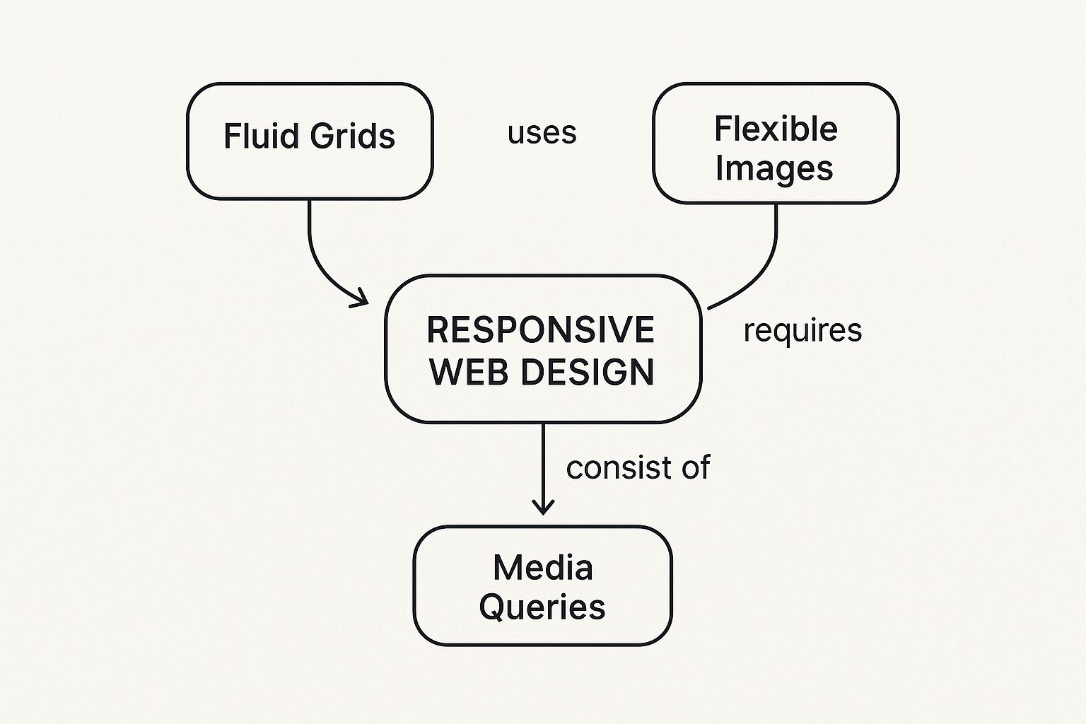
It highlights how fluid grids, flexible images, and media queries are all interconnected to create a seamless user experience.
Fluid Grids
First up, you have fluid grids. Imagine your website's layout is drawn on a stretchy, rubber-like grid instead of a rigid piece of paper. This grid uses percentages for its measurements, not fixed units like pixels.
So, if a column is set to take up 50% of a desktop screen, it will automatically adjust to take up 50% of a smaller phone screen, too. This is the flexible foundation – the LEGO baseplate – for your whole design.
Flexible Images
Next, you need flexible images. An image with a fixed size can completely wreck your layout on a small screen, forcing users into that frustrating side-to-side scroll.
Flexible images, on the other hand, are told to always fit within their container. They're the LEGO pieces that cleverly shrink or grow to fit the space available on the baseplate, making sure they never look awkward or out of place.
Media Queries
Finally, we have media queries. This is the real secret sauce. Media queries are simple filters in the website’s code that basically say, “Hey, if the screen is this small, rearrange the layout like this!”
They're the specific instructions that tell a three-column desktop layout to neatly stack into a single, easy-to-scroll column on a phone. Think of them as the rulebook telling your LEGO pieces exactly how to reconfigure themselves for different builds.
When these three elements work together, you get a beautiful, functional website that provides a great experience for every visitor, no matter their device. It’s a thoughtful approach that requires real expertise to get just right – a core part of our custom WordPress development process here at Navigator. We make sure every block is in the perfect place.
Why Customers and Google Love Responsive Design
A responsive website does a lot more than just look good on different screens; it delivers real, measurable business results. It’s all about creating a fantastic experience for every single visitor, which is something that both your customers and the search engines will thank you for.
We’ve all been there. You land on a website using your phone and suddenly you’re forced to pinch, zoom, and slide all over the place just to read a sentence. It's incredibly frustrating. More often than not, you just sigh, give up, and hit the back button. Your potential customers across the Okanagan do the exact same thing when they encounter a site that isn't built for their device.
Happy Visitors Become Loyal Customers
Think about it: when a visitor from Penticton lands on your site and can immediately find what they're looking for, they stick around. A smooth, seamless experience is one of the fastest ways to build trust and show you're a credible, professional business.
People browsing on their phones are in a different mindset. They have shorter attention spans, expect pages to load in a blink, and need big, easy-to-tap buttons so they don’t accidentally click the wrong thing. Responsive design solves all of this.
By meeting their needs, you make it much more likely they'll fill out a contact form, make a purchase, or give you a call. Your website stops being a static online brochure and becomes a powerful tool that welcomes every visitor, no matter how they find you. You can find more details about the powerful SEO benefits of responsive design in our guide.
Why Google Cares So Much
Just as important as pleasing your customers is pleasing Google, and the search giant absolutely rewards mobile-friendly sites. For years now, Google has used a “mobile-first” approach for ranking websites. This simply means it primarily looks at the mobile version of your site to figure out where you should appear in search results.
If your website performs poorly on mobile devices, you'll almost certainly face lower search rankings. This directly translates into higher costs to acquire new customers because you're much harder to find online.
At the end of the day, Google’s main goal is to give its users the best possible results. When your site offers a fantastic mobile experience, it sends a strong signal to Google that you’re a high-quality, relevant business. This helps you attract more local traffic, from West Kelowna to Vernon, connecting the dots between great design and a healthier bottom line.
Responsive Design in Action: An Okanagan Success Story
Alright, enough with the theory. Let's talk about what this looks like in the real world, right here in the Okanagan. It’s one thing to understand the concepts, but it's another to see the incredible difference a responsive website can make for a local business.
We recently had the pleasure of partnering with a fantastic boutique winery. Their old website was beautiful… on a desktop. But pull it up on your phone, and it was a completely different story. We see this all the time: a site that was a total nightmare on mobile.
The "Before" Picture: A Frustrating Experience
Picture this: you're a tourist exploring West Kelowna, and you hear about this amazing winery. You grab your phone to look them up. On their old site, this is what you’d find:
-
Tiny, unreadable text: You’d have to pinch and zoom constantly just to read their story or find their address.
-
A broken booking form: Trying to book a tasting was nearly impossible. The fields were minuscule, and the calendar was cut right off the edge of the screen.
-
Slow-loading images: Their gorgeous vineyard photos took forever to appear, if they loaded at all.
-
Difficult navigation: The menu was a complete mess, making it a real chore to find simple things like their opening hours.
Potential customers were dropping off left and right. The website analytics told a very clear story – people were landing on the site from their phones and leaving almost immediately. It was costing them real business.
The "After" Picture: A Seamless Transformation
This is where the magic happens. We worked with them to build a new, fully responsive website from the ground up, focusing entirely on the user’s experience. The change was immediate and powerful.
Now, when a visitor lands on their site from any device, they’re greeted with a seamless journey. The navigation menu neatly tucks itself away into a clean, easy-to-tap "hamburger" icon on mobile. Those stunning vineyard photos automatically resize to fit the screen perfectly, loading quickly and looking crisp.
Most importantly, the booking form is now a breeze to use. The fields are large, the calendar works flawlessly on a touchscreen, and a customer can reserve a tasting in under a minute. It’s simple, intuitive, and works exactly how it should.
This story perfectly illustrates the real-world impact of responsive design. It’s about more than just aesthetics; it’s about making it effortless for customers to connect with you. The truth is, your online presence is your digital first impression, and a staggering 94% of users judge a website based on its design. A well-optimized, responsive site can boost conversion rates significantly, turning casual browsers into paying customers.
For this Okanagan winery, the new site transformed their online presence from a point of frustration into their best salesperson. If this story sounds a bit too familiar and you’re wondering what the next step is for your own site, we’d be happy to start a conversation with you.
How Responsive Design Drives Local Ecommerce Sales
If you sell products online here in the Okanagan, a responsive website is your most powerful sales tool. It doesn't matter if you're selling local crafts, professional services, or bottles of wine. Your customers are shopping everywhere – while waiting for a coffee in Penticton, during their lunch break in Kelowna, or relaxing at home in Vernon.
People are constantly on their phones. If your online store is clunky, slow, or just plain broken on a mobile device, you are actively losing sales. It’s that straightforward.

Making Mobile Shopping Effortless
Think about the last time you bought something from your phone. Was it a smooth experience? A great responsive ecommerce site makes the entire process feel completely natural.
-
Browsing Products: Images are crisp and clear, text is easy to read without zooming, and you can swipe through product galleries without a single glitch.
-
Adding to Cart: The "Add to Cart" button is big, obvious, and easy to tap. You never have to second-guess where to click.
-
Checking Out: The checkout process is seamless. Forms are simple to fill out, and payment fields work perfectly on a small touchscreen.
This friction-free journey is what turns a casual browser into a happy, paying customer. It gets rid of all those little frustrations that make people give up and abandon their carts.
Building Trust That Turns Into Loyalty
A well-crafted site does more than just process transactions; it builds the trust you need to create loyal, repeat customers. When your site works flawlessly on their phone, it sends a clear message: you’re a professional business that cares about their experience. That positive first impression is absolutely critical.
Demand for custom responsive design is particularly strong in ecommerce, where personalization and mobile performance are everything. Shoppers now expect a fantastic mobile experience, which is why so many retailers are moving toward custom designs that stand out and work perfectly on any device.
A responsive ecommerce store feels less like a clunky machine and more like a helpful sales assistant. It guides the customer, answers their questions, and makes the final purchase feel secure and simple.
For local Okanagan businesses, this is a huge opportunity. A stellar mobile shopping experience can set you apart, helping you build a loyal following that chooses to support you again and again. While platforms like Shopify are powerful, they deliver the best results when built with a responsive-first mindset. If you're looking to build or improve your online store, we have extensive experience in creating high-converting Shopify ecommerce sites.
So, is your website truly ready to work everywhere?
We've walked through what responsive design is, why it’s no longer optional, and seen how it performs out in the wild. Now comes the moment of truth: is your own website pulling its weight on every single screen out there?
The idea of a redesign can feel daunting, I get it. But think of it this way: your website should be your most dedicated employee, working tirelessly to attract customers around the clock. If it’s only effective for a fraction of your audience—those sitting at a desk—then it’s essentially phoning it in.
Your website is often the very first impression you make. A clunky, frustrating mobile experience is like a weak handshake; it can make a potential customer walk away before you've even had a chance to introduce yourself.
This is where finding the right partner changes everything. Instead of juggling the technical bits and design principles yourself, you can team up with people who live and breathe this stuff—experts who know how to build a site that not only looks fantastic but functions as a powerful tool for your business.
If you're ready to stop wondering whether your website is costing you customers, let's figure out what comes next. We're here to help, so let's start a conversation and explore the possibilities together.
Common Questions We Hear About Responsive Design
We get asked these questions all the time by local business owners, so we figured we’d answer them right here. It's completely normal to have questions when you're looking at your website, and getting straight answers is always the first step.
Is Responsive Design the Same Thing as a Mobile-Friendly Site?
That’s a great question, and one we hear a lot. They’re definitely related, but they aren't quite the same thing.
Here’s a simple way to think about it: "mobile-friendly" is the goal, and "responsive design" is the modern, most effective way to get there. A responsive site is inherently mobile-friendly because it uses a single, intelligent design that adapts to every screen.
You might remember some older sites tried to solve the mobile problem by building a completely separate version just for phones (you'd often see them with a URL like 'm.yourbusiness.com'). Responsive design is a much smarter approach. You only have one website to update and manage, and it guarantees every visitor gets a consistent, top-notch experience.
How Can I Check if My Current Website Is Responsive?
There's a really easy way to test this right now. Go ahead and open your website on your desktop or laptop computer.
Now, just grab the corner of your browser window and slowly drag it to make it narrower. Watch what happens to the content on your page as the window gets smaller.
If everything on the page automatically rearranges itself—images resizing, text re-flowing, and columns stacking neatly on top of each other—congratulations, your site is responsive! If the content gets cut off and you have to scroll horizontally to see everything, then your site isn't built to be responsive.
Does My Small Okanagan Business Really Need a Responsive Website?
Yes. Without a doubt. For a small, local business, having a responsive website is arguably more critical than for a massive corporation.
Think about how your customers find you. They're often on their phones, already out and about in the Okanagan, looking for a service right now. If they land on your site and can't easily read your menu, find your number, or see your address, they'll just hit the back button and go straight to your competitor. A responsive site ensures you capture every single one of those opportunities, making sure you're ready for business whenever and wherever a customer is looking.
Your website should be your hardest-working employee, bringing in leads and customers 24/7. If it's not pulling its weight on every device, Navigator Multimedia can help you turn it into your best salesperson. Let's start a conversation.