Your Friendly Guide to Website Accessibility Standards
Let's talk about website accessibility standards. It sounds a bit formal, but really, we're just talking about a shared rulebook for the internet. Think of it as laying down a digital welcome mat to make sure everyone, including people with disabilities, can easily use your website. It’s all about building an online space that’s open and welcoming to every single person who might stop by.
So, What Exactly Are Website Accessibility Standards?
Ever feel like there’s a secret language to websites? Terms like 'WCAG' and 'AODA' get tossed around, and it's easy to feel a bit lost in the acronyms. Don't worry, let's cut through the noise.
At their core, website accessibility standards are just a set of practical guidelines for your website. Their goal is simple: making sure your online presence works for everyone, no matter what their abilities are. It’s about creating a digital space that’s truly open to every potential customer, whether they're down the street in Kelowna or clear across the country.
This is a really big deal now. An accessible site helps you connect with a much broader audience and clearly shows that your brand is serious about including everyone.
Why These Standards Matter More Than Ever
Accessibility guidelines aren't just polite suggestions—in many places, they're now legal requirements.
For instance, the Accessibility for Ontarians with Disabilities Act (AODA) requires many organizations to make sure their websites and web content meet WCAG 2.0 Level AA. This law has set a strong example across Canada, pushing businesses in other provinces to adopt similar practices for digital inclusion and avoid potential legal headaches.
This handy illustration from the W3C really captures the spirit of what we're aiming for.
It’s a powerful visual reminder that accessibility is designed to support people with a wide range of needs, including auditory, cognitive, neurological, physical, speech, and visual disabilities. And the best part? This creates a better online experience for all users.
At its heart, a website built on solid accessibility standards is simply a more user-friendly website. It’s easier to navigate, simpler to understand, and works better across different devices… which is great for every visitor.
In the end, these standards give you a clear roadmap for creating a website that truly serves your entire community. They help make sure your digital front door is wide open to everyone, and that's just good business.
It’s a journey, of course. For many of the small businesses we partner with in Vernon and Penticton, the first step is just getting a handle on what these guidelines are really asking for. No complicated jargon, just a straightforward starting point for making your website work better for everybody. If you're wondering where your site currently stands, that’s something we can help with. Just get in touch with our team, and we can take a look together.
Decoding WCAG Levels: A, AA, and AAA
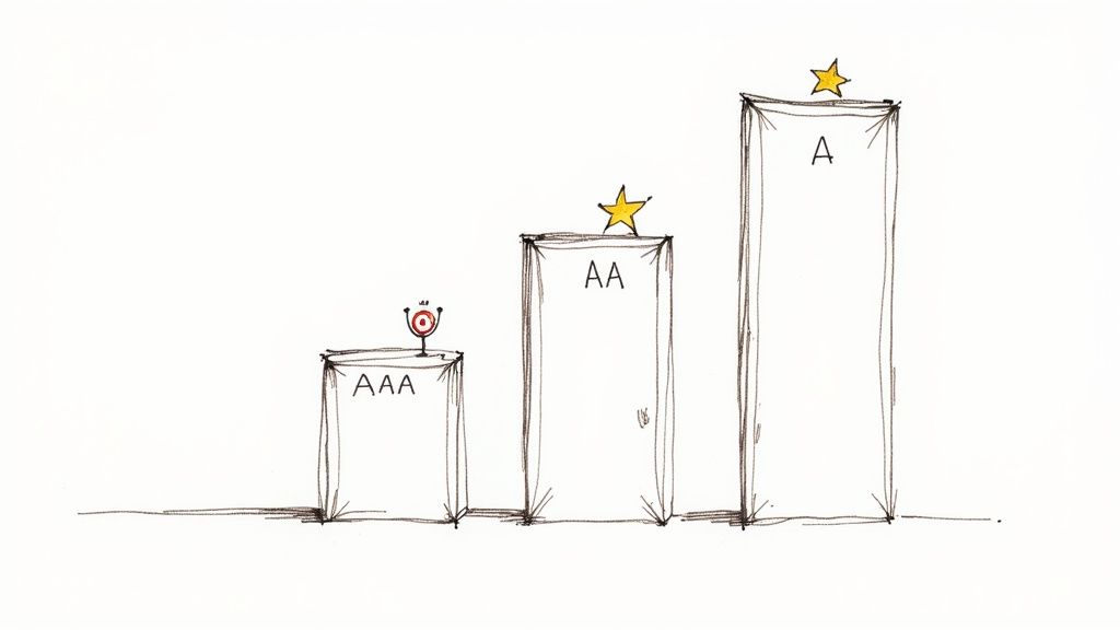
So, you've probably seen these letters floating around: A, AA, and AAA. These are the conformance levels for the Web Content Accessibility Guidelines (WCAG), and they're much simpler to understand than they look.
Think of them as tiers of achievement. Each level builds on the last, making your website progressively more welcoming for every visitor. Getting a handle on these levels helps you set a realistic and meaningful target for your own site.
Level A: The Foundation
Level A is the absolute minimum. It tackles the most severe and common barriers that can completely block someone from using your website. If you don't meet these criteria, some people just won't be able to access your content at all.
This is the essential, non-negotiable stuff. For example, every single image needs alternative text (alt text) so a screen reader can describe what's in the picture. All videos need to have captions.
These basics lay the groundwork for everything else. Every business, from a small cafe in West Kelowna to a large corporation, should view this as the first—and most crucial—step.
Level AA: The Industry Standard
This is the sweet spot. Level AA is the conformance level referenced by most accessibility laws worldwide, including Canada’s AODA. It addresses the most common and significant roadblocks that users with disabilities run into online.
Meeting Level AA means you've made your site genuinely accessible to a much broader audience. The requirements here focus on making your content easier to see, hear, and operate.
A few examples of what Level AA requires include:
-
Colour Contrast: Text must have enough contrast against its background to be easily read. This is a huge help for anyone trying to view your site on a phone in the bright Okanagan sun!
-
Resizable Text: Users need to be able to increase text size up to 200% without the page breaking or losing its core functionality.
-
Clear Navigation: Your website’s navigation has to be consistent and predictable. Menus and links should work the same way no matter which page you're on.
For the vast majority of businesses, hitting Level AA is the main goal. It shows a real commitment to inclusivity and provides a solid, usable experience for almost everyone.
Reaching for Level AA is about making a practical and impactful improvement. It’s the standard that ensures your digital door is open to almost everyone, which is not just good for your community—it's fantastic for business.
Level AAA: The Gold Standard
Level AAA is the highest you can go—the black belt of web accessibility. This level gets into more nuanced criteria that make your content accessible to the widest possible audience, addressing very specific challenges.
Achieving full Level AAA conformance across an entire site is tough, and honestly, not always practical for every piece of content. For instance, one AAA requirement is providing sign language interpretation for all pre-recorded videos. While incredible, that might be out of reach for a small business's marketing budget.
But you don't need to hit every AAA guideline to make a big difference. We often help clients pick out specific Level AAA criteria that are relevant to their audience and simple to implement. It’s all about making smart choices that elevate the user experience even further.
To help you visualize the differences, here’s a quick breakdown of what each level means in practice.
WCAG Conformance Levels at a Glance
| Conformance Level | What It Means | Example for a Kelowna Business |
|---|---|---|
| A (Essential) | The most basic level of accessibility. Fails here mean some users can't access your site at all. | A local winery ensures all images of their vineyard have alt text describing the scene. |
| AA (Ideal Target) | The globally accepted standard. Meets legal requirements and removes common barriers for most users. | A downtown restaurant's menu has sufficient colour contrast so people with low vision can read it easily. |
| AAA (Highest) | The "gold standard." Provides an enhanced level of accessibility for the widest possible audience. | A regional tourism board provides sign language interpretation for its promotional videos. |
Ultimately, the goal is to make your website as welcoming as possible. While Level AA is the target for legal compliance and best practices, striving for a few AAA wins shows you’re committed to going the extra mile.
If you're wondering what the right target is for your business, we can help you build a clear roadmap. Just get in touch with our team, and we can start the conversation.
The Four Pillars of an Accessible Website
Alright, let's pull back the curtain on all the rules and guidelines. When you get right down to it, the official website accessibility standards are built on four simple but powerful ideas.
It’s all summed up in a handy acronym: POUR. That stands for Perceivable, Operable, Understandable, and Robust.
Thinking about accessibility through the POUR framework makes everything a lot easier to grasp. It helps you focus on four straightforward questions about the user experience instead of a daunting checklist of technical rules. Let's break down what each of these pillars really means for your website.
Pillar 1: Perceivable
This one is all about the senses. Can people actually see, hear, or otherwise take in the information you're presenting on your site? It’s about making sure your content is available to users in a way their brain can process, even if they have a sensory disability.
Think about it this way: if someone can't see the beautiful photos of your Okanagan winery, can they still get a feel for the place? This is where things like alternative text (alt text) for images become so crucial. A screen reader can describe the image to a visually impaired user, so the experience isn't lost.
Perceivable means your website's information can be consumed by everyone. This involves providing text alternatives for non-text content, adding captions to videos, and making sure your content can be presented in different ways without losing its meaning.
In fact, failing to provide alt text is one of the biggest hurdles online. A recent report from California showed that a lack of alt text was a factor in about 25% of top accessibility complaints. It’s a small detail that makes a massive difference, as you can see by diving into the findings on common accessibility barriers.
Pillar 2: Operable
The next pillar is all about action. Can everyone actually use your website and its navigation? An operable website is one where anyone can perform the actions needed to get around, from clicking buttons to filling out forms.
This is a big one. For example, some people can't use a mouse due to motor impairments, so they rely entirely on their keyboard. An operable site lets them navigate everything using just the tab, enter, and arrow keys. Can you tab through your menu, select services, and complete a contact form without ever touching a mouse?
Here are a few key ingredients for an operable site:
-
Keyboard Accessibility: All features, links, and buttons must be usable with a keyboard.
-
No Keyboard Traps: A user should never get "stuck" on a part of your page when navigating with their keyboard.
-
Sufficient Time: Users are given enough time to read and use content. No surprise timeouts that force them to start over.
Basically, an operable website doesn't force anyone to interact with it in a way they can't manage.
Pillar 3: Understandable
Clarity is king. This pillar focuses on making sure your website's information and its operation are easy to comprehend. A visitor should be able to figure out how your site works and digest the content without getting confused.
This goes beyond just the words on the page; it's about creating a predictable, consistent experience. Does your navigation menu stay in the same place from page to page? Are your forms clearly labelled with instructions that actually make sense?
You’ll want to avoid industry jargon and use plain language wherever possible. Your goal is to make the experience feel intuitive and effortless for every single user, reducing their frustration and helping them find what they need… fast.
Pillar 4: Robust
The final pillar, robust, might sound a bit technical, but the idea is simple. Your website should be built well enough to work reliably with a wide variety of technologies, including assistive ones like screen readers.
This really comes down to using clean, standard-compliant code. When your site is robust, it can be interpreted accurately by different web browsers and assistive devices, both today and in the future. You're essentially future-proofing your website.
A robust site is also one that performs well across different devices, from a desktop computer in a Vernon office to a smartphone on a beach in Penticton. It's closely tied to the principles of solid development and is a key part of what makes for a truly responsive web design. Making sure your site is solid under the hood ensures it works for everyone, everywhere.
If you’re starting to see how these four pillars work together to support a better experience for all users, you're on the right track. And if it feels like a lot to manage, that's what a good partner is for. We can help you sort through it all. Just reach out to our team when you're ready.
Common Accessibility Issues We See on Local Websites
Let's get practical for a moment. After auditing and rebuilding hundreds of websites right here in the Okanagan, we've noticed the same accessibility hurdles popping up time and time again.
These aren't usually complex, deep-in-the-code problems. More often than not, they're small oversights that can create major roadblocks for your visitors. Identifying these common tripwires is the first step toward creating a truly welcoming online space for everyone.
Low Contrast Text and Colours
This is, without a doubt, the number one issue we find. It happens when the colour of your text is too similar to its background colour, making it incredibly difficult, or even impossible, to read. Think light grey text on a white background, or a stylish pastel colour scheme that sacrifices legibility for looks.
This is a serious barrier for people with low vision, but it's a pain for just about everyone else, too—especially someone trying to browse your site on their phone in the bright Okanagan sun. Bumping up your colour contrast is a simple fix that makes a world of difference.
The Dreaded "Mystery Meat" Navigation
You've seen this a thousand times. It’s those vague, unhelpful links that just say "Click Here" or "Learn More" without giving you any clue what you're actually learning more about.
For someone using a screen reader, this is a navigational nightmare. The software often reads out a list of all the links on a page to help the user scan. A list of "Click Here, Click Here, Click Here" is completely useless. Instead, your link text should be descriptive, like "Download Our 2024 Catering Menu" or "Read Our Guide to Local Trails." It's just clearer for every single user.
This same problem applies to images used as links when there's no descriptive text attached. If a visitor doesn't know where a click will take them, they probably won't click at all.
Missing Captions and Transcripts for Media
Video is a brilliant tool for connecting with your audience, but if you don't include captions, you're shutting a huge portion of that audience out of the conversation.
This obviously includes people who are deaf or hard of hearing. But it also includes the person scrolling on their phone in a quiet waiting room, a parent with a sleeping baby nearby, or someone in a noisy coffee shop. Captions make your content accessible to more people in more situations. It's a win-win.
Forms That Are Impossible to Fill Out
Have you ever tried to fill out a contact form that was confusing, clunky, or just plain broken? It’s incredibly frustrating.
For people who rely on a keyboard or other assistive technologies to get around the web, a poorly built form can be a complete dead end. Some of the most common issues we fix are:
-
Missing Labels: Without a clear label, an input field is just an empty box. Users are left guessing what information they're supposed to enter.
-
Vague Error Messages: When something goes wrong, a generic "Error!" message is no help. The form should clearly state what needs to be fixed and where.
-
Keyboard Traps: This happens when a user can navigate into a form field with their keyboard but can't navigate back out, essentially trapping them on the page.
Fixing these small but crucial form elements can have a massive impact on your ability to generate leads and hear from your customers.
The thing is, these common issues aren't just frustrating for users—they can also create real legal risks for businesses. Neglecting website accessibility standards is becoming a bigger and bigger liability.
The rise in digital accessibility litigation is undeniable, with recent years seeing a significant increase in cases filed across North America. This trend is heavily concentrated in specific regions, with California, New York, and Florida accounting for a large majority of all web-related lawsuits. This shows a clear pattern of increased legal enforcement and risk for businesses that don't take accessibility seriously. You can learn more about the legal trends in web accessibility and why this is becoming so important.
We've seen how crucial this is for local businesses, especially in sectors like tourism where a welcoming experience is everything. Making your website accessible for tourists with disabilities is a powerful way to expand your market. We've actually put together a guide specifically on improving website accessibility in the tourism industry that dives deeper into this.
Spotting these issues is the first step. The next is building a clear plan to fix them, and that's exactly what we'll talk about next.
Your Simple Path to an Accessible Website
Feeling a bit overwhelmed? It’s completely normal. The idea of meeting all the different website accessibility standards can feel like a huge, technical project looming over your head. But it doesn’t have to be.
Making your site more accessible is a journey… not a one-and-done task. Every single step you take makes a real difference for your visitors. Let’s walk through a straightforward approach that any business owner can follow to get started.
Start With a Simple Check-Up
Before you can fix anything, you need to know where you stand. The first step is a basic audit to get a snapshot of your website’s current health. The good news is, you don’t need to be a developer to do this.
Start by trying to navigate your own site using only your keyboard. Can you get to every page? Can you fill out your contact form? This simple test can reveal a surprising amount about how operable your site is for people who can't use a mouse.
Next, you can use a free online tool, like a colour contrast checker, to see if your text is easy to read against its background. These initial steps give you a baseline and help you see the challenges some of your visitors might be facing every day. This process often reveals common issues right away.
This flow diagram shows a few of the most frequent problems we see, from text that's hard to read to videos that leave some users behind.

As you can see, small oversights in design and content can quickly create dead ends for visitors, preventing them from connecting with you.
Prioritize for the Biggest Impact
Once you have a list of issues, it's easy to feel like you have to fix everything at once. Don't. The key is to prioritize what to tackle first, focusing on changes that will have the biggest impact for the most people.
We call this tackling the "big rocks"—the critical barriers that completely block someone from using your site.
A great place to start is with your most important user pathways. Can everyone book an appointment, buy a product, or find your phone number? Fixing barriers on these key pages delivers the most value right away.
Here’s a simple way to think about prioritizing:
-
Blockers: Fix anything that completely stops someone from completing a task, like a form that can’t be submitted.
-
Major Hurdles: Address issues that make tasks extremely difficult, such as hard-to-read text or confusing navigation.
-
Minor Annoyances: Tackle the smaller things that create a clunky experience but don’t stop the user entirely.
This approach ensures you’re making meaningful progress without getting bogged down in the small stuff. It’s all about creating momentum.
Making It Part of Your Process
The final step is to bake accessibility into your regular routine. This is especially important for businesses using popular platforms like WordPress or Shopify. Both have accessible themes and plugins available, but how you use them matters most.
Whether you manage your website yourself or work with a partner, understanding the basics of a content management system is a huge advantage. You can learn more about how a CMS works in our guide.
From here on out, every time you add a new blog post, upload a new photo, or create a new product page, just ask yourself a few simple questions:
-
Did I add descriptive alt text to my images?
-
Are the colours I used easy to read?
-
Is my link text clear and descriptive?
Making accessibility a habit turns it from a massive project into a simple, ongoing part of how you do business. The goal is steady progress, not instant perfection.
Of course, if this whole process feels like more than you want to take on, that’s exactly what a good partner is for. We can handle the technical audit, build a clear roadmap with you, and get the work done right. Just get in touch with us when you’re ready to take the next step.
When it comes down to it, making your website accessible is about so much more than just ticking boxes on a checklist. It's about putting your company's values into action and showing that you’re genuinely invested in the community you serve.
It’s a clear signal that you value every single person who wants to engage with your business, from Penticton all the way to Vernon and beyond. This is how you build real trust and demonstrate that you're here for everyone.
Think of it like this: an accessible website is your hardest-working team member. It's on the job 24/7, welcoming every visitor and ensuring they feel seen and respected. It works quietly in the background to reach more customers, build lasting loyalty, and strengthen your reputation around the clock.
An accessible website is a true partnership between your business and your community. It’s your digital handshake, promising every visitor a positive and respectful experience with your brand.
This approach transforms a simple website from a static brochure into a dynamic, powerful asset. It's a genuine commitment to excellence and a reflection of your dedication to serving every member of your audience with the same high standard of care.
If you're ready to make your website a place where everyone feels welcome but aren't sure where to begin, that’s exactly what we’re here for. It can feel a bit overwhelming, and having a partner to guide you through the process can make all the difference.
We can help you navigate the complex website accessibility standards and implement the changes that truly matter. Let's work together to ensure your digital front door is wide open to everyone. Contact us when you're ready to start the conversation.
Frequently Asked Questions
We get it. The world of website accessibility standards can feel like alphabet soup at first. Here are a few questions we hear all the time from business owners trying to figure out what this means for them.
Does my small business website really need to be accessible?
Yes, absolutely. Forgetting accessibility means turning away a huge audience, including many potential customers with significant spending power who will actively seek out businesses that welcome them.
Beyond the clear business case, it's quickly becoming a legal expectation. For instance, laws like the AODA in Ontario signal a clear trend toward enforceable accessibility standards. Under the AODA, the penalties are no joke: corporations can face fines up to $100,000 per day, and individuals up to $50,000 per day for violations. You can learn more about Ontario's accessibility laws here.
What's the difference between accessibility and usability?
This is a great question. Imagine you're building a new home here in the Okanagan.
Accessibility is making sure everyone can get through the front door. It’s the ramp for a wheelchair user, a doorbell that also flashes a light for someone who is hard of hearing, and clear signage for visitors. It’s about making sure everyone can get in and use the space.
Usability is what makes the home enjoyable and intuitive once they’re inside. Is the light switch right where you'd expect it to be? Is the kitchen layout logical? This is about making sure the experience is smooth and pleasant for all users. You can’t have great usability without a solid foundation of accessibility.
Can I just use an accessibility plugin to be compliant?
If only it were that simple. While some plugins and automated widgets can catch a few low-hanging-fruit issues, they are not a magic fix. In fact, many popular "overlay" widgets can actually introduce new problems, clashing with the assistive technologies people rely on and making the site even harder to navigate.
True accessibility requires a thoughtful approach that combines smart automated checks with real human testing. There’s no substitute for building a genuinely usable experience right into the website's code.
A proper accessibility strategy is about making an ongoing commitment to ensure your digital doorstep is genuinely open to everyone.
If your website isn't pulling its weight, Navigator Multimedia can help you turn it into your best salesperson. Contact us, and let's make sure your online front door is open to everyone.