5 Product Page Improvements Used To Sell More Wine Online.
The product detail page on any Ecommerce website is the final step in the buyer journey before adding the item to the cart. This page plays a critical role in how well a website will convert website visitors into cutsomers. In this article, we’ll review 5 parts of a product page that can help the buyer make an informed, confident purchase decision. From the perspective of the wine industry, we’ve simplified wine product pages by covering the Call To Action, Online Reviews, Photography, Pricing, and Product Descriptions.
Despite $7.2 billion in wine industry sales in 2017, online sales continue to make up a teensy, tiny percentage. Just around 8 percent, in fact.
Why is that? My hunch is on a low-converting website experience.
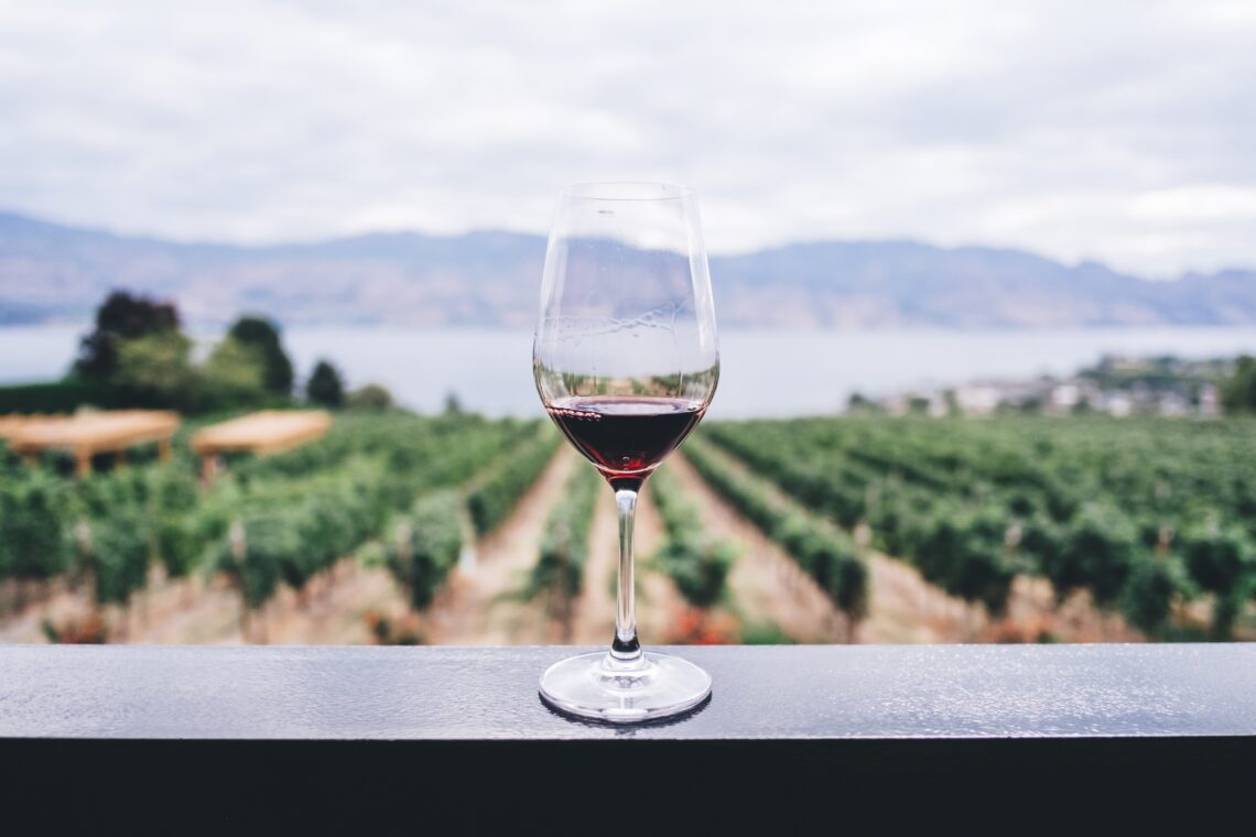
When guests enter your winery, they have the benefit of experiencing it with all their senses. They can see the winery’s architecture, taste the wines, and listen to your sommelier describe each vintage. The intent of an online product page is to replicate this experience digitally.
Author of the 2019 Wine Industry Report, Rob McMillian argues that wine sales rely on “the experience” provided through the tasting room, but this has led to the exclusion of other strategic sales options. Beyond the tasting room, there is your website. Is it doing a good job of selling your wine? There are a lot of aspects on a product page that can be fine-tuned for better sales.
Here are 5 ways to improve your winery product pages, so you can sell wine without shoppers tasting a drop.
1. Don’t Get Flashy With Your Call to Action
A Call To Action (CTA) instructs the consumer to act in some way. An effective CTA creates a sense of urgency that compels the consumer to follow through on the desired action. In the case of ecommerce, CTAs usually focus on encouraging the consumer to make a purchase. A Quicksprout article on optimizing product pages outlines the basics of creating your CTAs. Here’s a quick summary of their suggestions:
- Use Clear, Basic Wording.
CTAs tell your online shopper what to do. You want it to be easy to understand. Confusing your consumer means they are less likely to follow through on that action. Use a common eCommerce CTA, such as Buy Now or Add To Cart.
- Make It Bold.
The CTA button should stand out from the rest of the page. Choose a colour different from the background and use a large text size. Not a designer? No problem. We have services for improving the look and feel of your website, including the enhancement of product pages, right down to the button colours.
- Keep It Visible.
Your CTA button should be located above the fold on your wine product page. If your CTA button isn’t immediately visible, the extra expense of scrolling means that you could lose conversions. Best practice is to place the button beside your product photo.
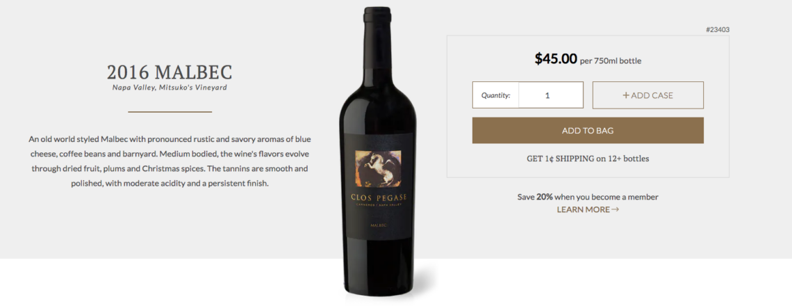
The Clos Pegase Winery has perfected the CTA on their product page of the 2016 Malbec. Notice how the CTA button stands out due to its size and colouring. There’s no confusion how a consumer can purchase a bottle or case.
2. Give Your Consumers A Voice With Online Reviews
An online survey conducted by Zendesk in 2018 found that consumers are more likely to share their customer service experiences now in comparison to five years ago. This is good news for online retailers, because online reviews increase the credibility of a product.
An online review provides social proof that another shopper purchased the same product and was satisfied with the outcome. Online reviews may invoke the Principle of Consensus where we look to the actions of others to aid in our own decision-making process.
In fact, Bright Local’s 2018 Consumer Survey revealed that 91% of consumers (aged 18-34) consider online reviews with the same level of trust as a personal recommendation.
On your wine product page, build the trust of online shoppers by including a section for online reviews. Cedar Creek Winery has shown best practices for listing online reviews on their product pages.
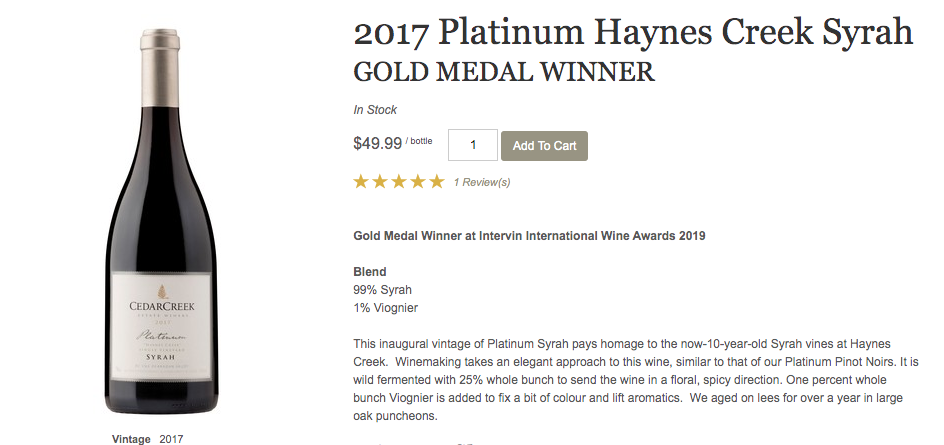
On the page for their 2017 Platinum Haynes Creek Syrah, Cedar Creek summarizes the wine’s rating out of 5 stars. This rating is located above the fold and close to the CTA button, but if the online shopper wants to read more, the full product review can be found at the bottom of the page.
3. Capture Your Wines With Innovative Product Photography
Here are 3 tips to make a lasting impression with your product media.
A. Professional Photography Is A Must.
Since they are unable to physically see or hold it, online shoppers rely on photographs to get a visual representation of your product. A product page with poor photo quality, suggests that the product is low quality.
In a brick and mortar store, a shopper is able to browse your wine selection and pick a bottle off the shelf. On your wine product pages, aim to replicate this experience by using high resolution, well-lit photos of your product. It is essential for your wine label to be clear and legible.
Pro-tip: Add A Zoom Function To Product Photos
Author from ConversonXL, Peep Laja suggests including a zoom function on your product photos. A zoom feature builds trust with your consumer because it allows them to examine your product more closely. When dealing with wine bottles, zooming in allows the consumer to read the label. The goal is to simulate holding the wine bottle in your hand and that means the ability to look more closely.
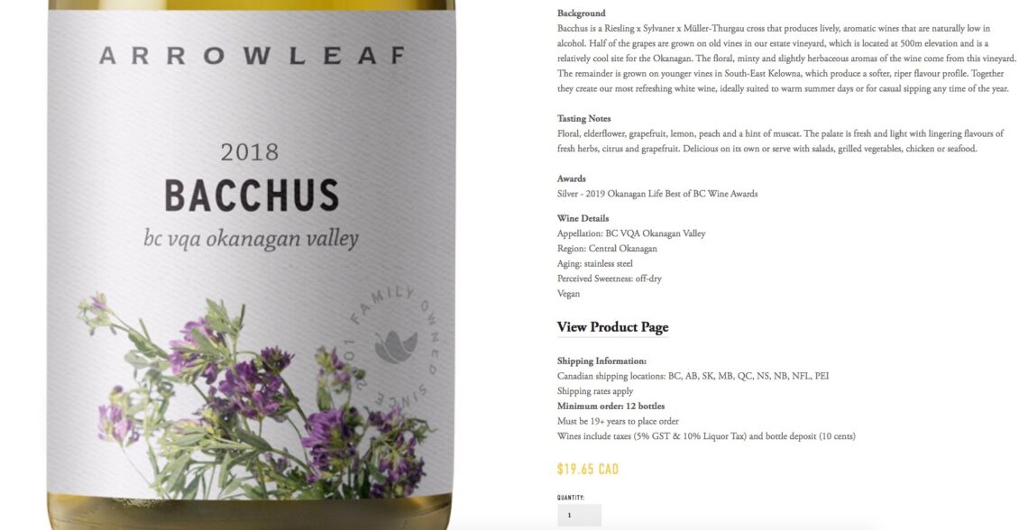
On their product page, ArrowLeaf Cellar includes a large, professional photo of their Bacchus 2018 vintage. As you can see below, the zoom feature allows the consumer to read every bit of label, including the VQA certification and declaration as family-owned since 2001.
B. Use Photos That Provide Context
In their eyetracking research studies, Nielsen Norman Group identifies disparities between photos that capture the consumers attention and those that don’t. Here is the important lesson learned from the research: photos that provide valuable product information hold a consumer’s attention, while simply decorative images don’t.
See below for an example comparing eyetracking of the search results from Pottery Barn and Amazon.
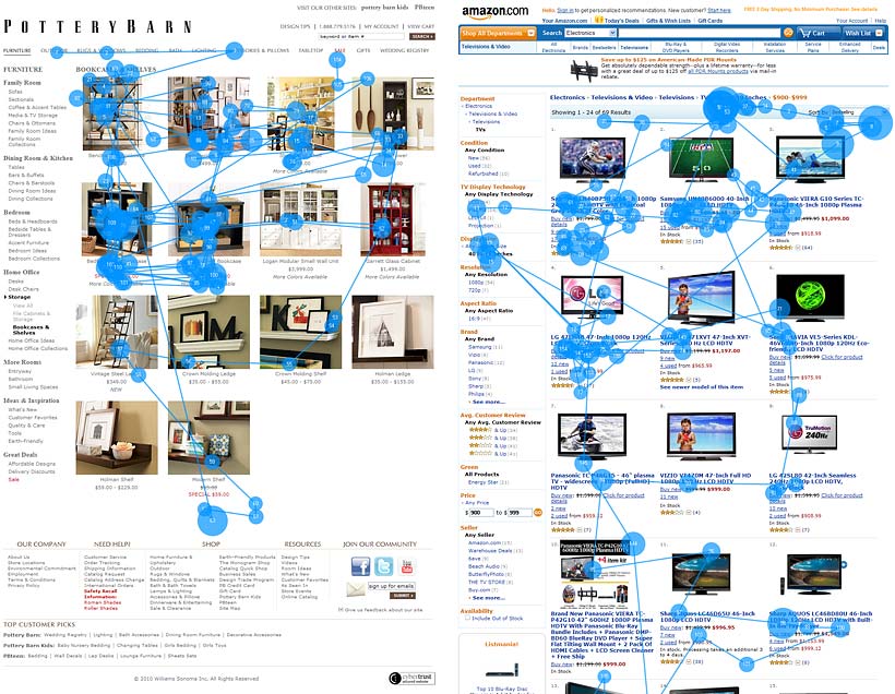
The images used in the Pottery Barn results hold the consumer’s attention for longer. This is because of the type of images used. The images from Pottery Barn give context to the consumer (this product matches this interior decor), rather than Amazon’s approach of simply photographing the product. Additionally, adding context to the image makes it easier for the consumer to imagine the product as part of their life (your interior decor could look this stylish, if you buy this shelf).
In short, consumers want photographs that are useful and valuable in their decision to purchase the product.
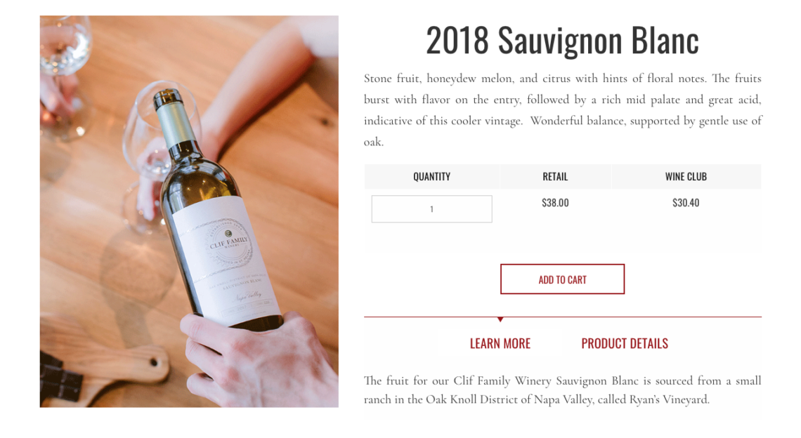
Clif Family Winery included a human element to this product photo of their 2018 Sauvignon Blanc. As seen below, the hand pouring the Sauvignon Blanc gives context to the consumer and it makes it easier for them to imagine how this wine can add value to their life. If I purchase this wine, then I can share it with others.
C. Change Up The Perspective
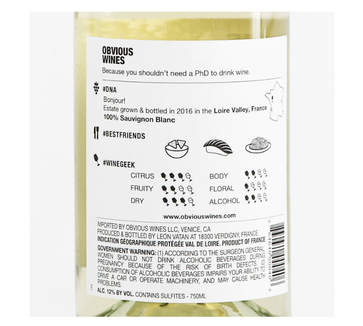
In the wine industry, product pages commonly use a single photo of the front of a wine bottle. However, this approach forgets one key element. When a wine shopper wants additional information, they turn over the bottle to read the back label. The online shopping experience shouldn’t deprive them of that ability. Paired with the ability to zoom, seeing the back label gives the consumer an opportunity to read further into the wine.
Obvious Wines breaks the mold with their Nº02 BRIGHT and CRISP by using product photos from all angles, including the back label.
Pro-tip: Include A Product Video
In a recent study, 92% of online consumers admitted that video visuals were the most influential element that impacted their buying behaviour. Consider this product page featuring the 2014 Cabernet Sauvignon from Cakebread Cellars.
When you access the webpage, a video plays a slow pan around the featured wine bottle. Notably, the video also includes the featured wine in a glass and an assortment of fruit and cheese. This video gives the viewer an in-depth perspective of the product by showing the wine — both in the bottle and glass. Additionally, the video adds context by showing the consumer what food pairs with the 2014 Cabernet Sauvignon.
4. Don’t Just Tell Your Shoppers The Price, Show Its Value
It is standard and expected practice to list pricing for the product on its product page; the author of this Quicksprout article argues that retailers should not only display pricing, but also justify it. Tempt your consumer to make a purchase by describing the value of your product. Share product specifications and information that justify the price tag.
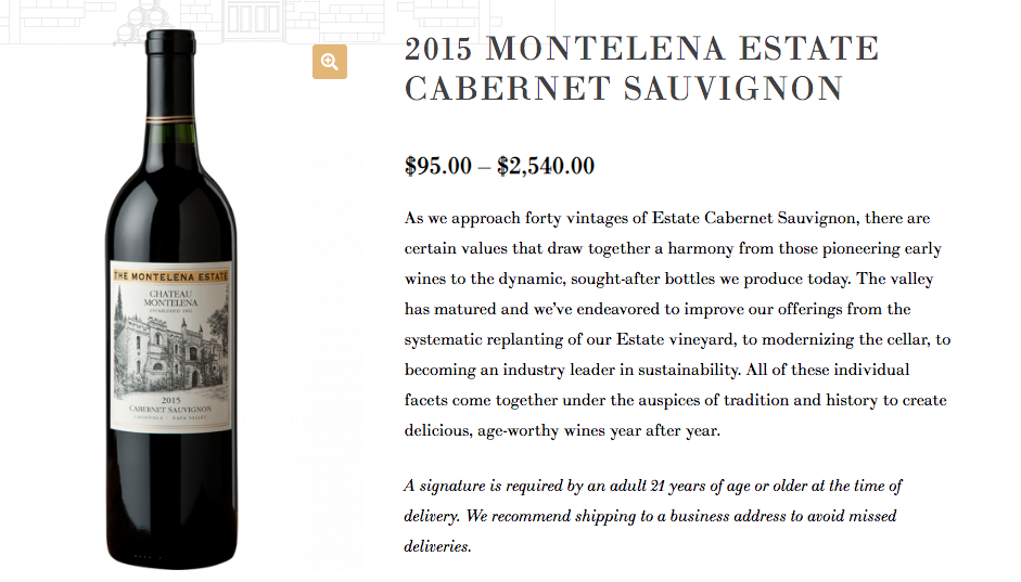
The product page of their 2015 Estate Cabernet Sauvignon, Montelena Winery establishes their long-standing history “pioneering early wines”, but also details their recent efforts to improve their wines through systematic replanting and modernizing their cellar. Because Montelena Winery justifies why their wines are sought-after, the consumer is able to justify a higher price point.
5. Creating Compelling Product Descriptions
Research conducted by MarketingExperiments revealed the value of a well-placed product description. In their product page experiment, results revealed a 78% increase in conversions when the product descriptions were located higher on the page.
Writing for the web and writing for print are not one and the same, and so your online product descriptions deserve special and specific attention. Three things are key to writing a compelling product description.
A. Explain Product Benefits
In her Shopify article on product descriptions, Henneke Duistermaat suggests persuading the consumer with product benefits. Notably, telling the consumer about benefits is different than simply listing product features. Duistermaat highlights how copywriters can list both product features and benefits with this two-step strategy. First, list the product feature, then and explain why that feature benefits the buyer.
In their product page description, Domaine Carneros Winery explains why they aged the 2014 Clonal Series Martini Pinot Noir, so you don’t have it. This is more effective than simply stating that the Clonal Series Martini Pinot Noir is aged.
“Aromatically the wine is assertive in demonstrating its Carneros heritage with notes of bramble, saddle leather, and fresh strawberry. There is more to come, for the patient taster is rewarded with additional surprises. Resting on the cork since February of 2016 this wine has had ample time to develop, 2 ½ years, so it can be enjoyed with confidence now. Of course, large bottles are rightly famous for their aging potential and this one is no exception. “
B. Format For Readability
Dense paragraphs are daunting for readers, especially when it comes to product descriptions. The goal is to convince consumers to make a purchase as quickly as possible, which means they should be able to read your product description at glance.
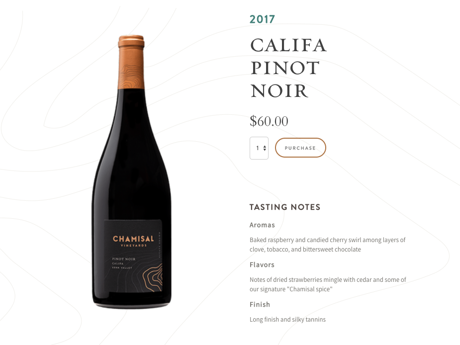
This Califa Pinot Noir product page by Chamisal Vineyards organized their product description according to different categories, each with a brief summary. By separating their tasting notes in Aromas, Flavours, and Finish, the description is concise and easy to scan.
C. Tell A Story
Storytelling is a powerful mechanism that can boost conversions on your wine product pages. Rob Walker and Joshua Glenn revealed the influence of storytelling in the Significant Object Project.
In their anthropological experiment, Walker and Glenn had writers create compelling narratives for various thrift shop products. These objects were purchased for an average of $1.25, but sold on Ebay for nearly $8,000 when accompanied with an intriguing story. Use the power of a well-crafted story to show your consumers the value of your wines.
On their product page, Cliff Lede Vineyards shares the story of the wine at each stage of the winemaking process, the vineyard, production, and the final notes by the winemaker.
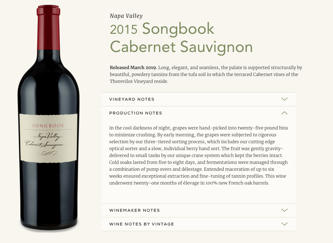
Describing the cool darkness of the night when the grapes were picked gives the consumer a vivid picture of the labour that created the 2015 Songbook Cabernet Sauvignon. Because Cliff Lede Vineyards shares these details, it gives the consumer a deeper connection to the wine and compels them to purchase it. Don’t be afraid to include stories from your viticulturist or winemaker in your product descriptions. After all, who doesn’t love a bottle of wine with a good story?
Want to improve your winery’s product pages for better online sales? Book a free chat with Scott to learn more!