Google Maps Reveals A New Look
In a push for a more simplistic design and to enhance the user experience, Google has recently implemented a few new updates to Google Maps.
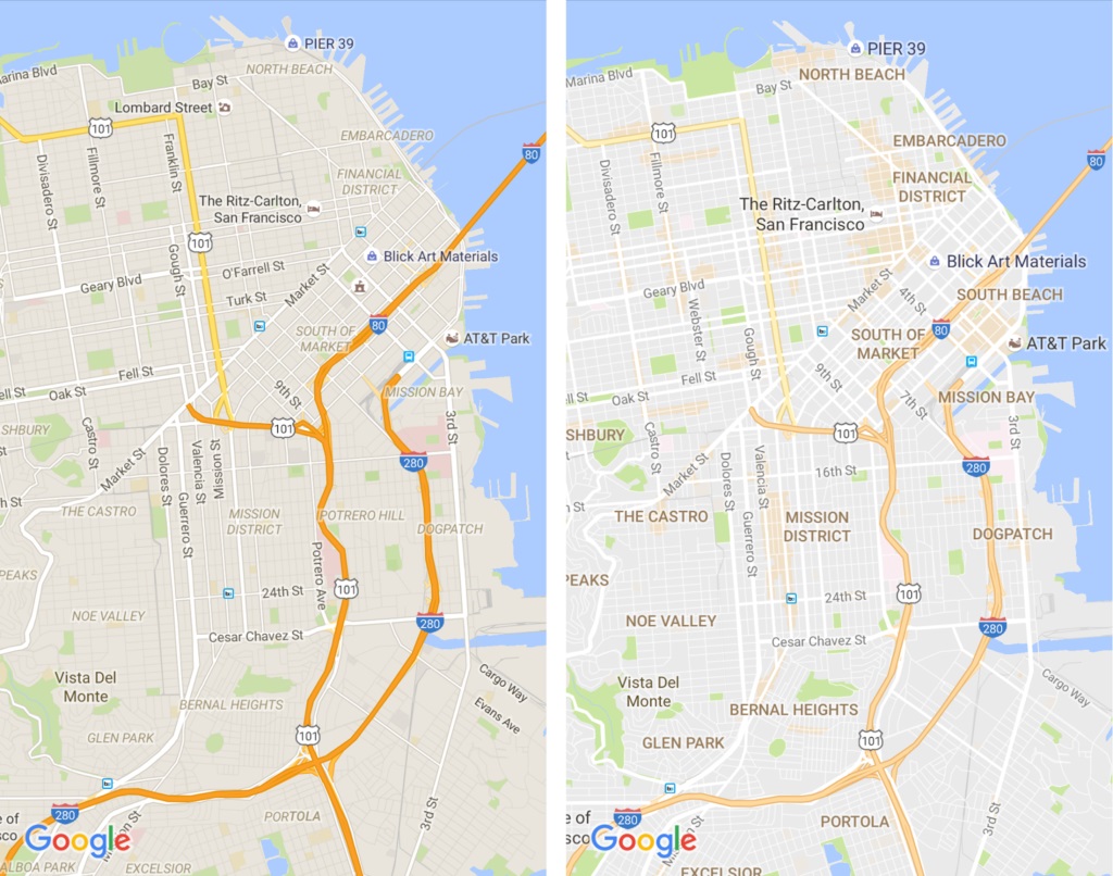
The biggest difference in this new update, is the colour scheme applied to help differentiate between locations. Google hopes this feature will enable the user to subtlety compartmentalize the information. Then, a specific location will be easier to distinguish from it’s surrounding area. For example, freeways are coloured in a pale honey, while light pink is attributed to hospitals.
Google has made an effort to remove any aspects of their map design that clutter the more essential information. Road outlines have been removed to aid in a cleaner look, allowing quicker access to instructions on traffic and transit. Improvements to the typography on Google Maps were made to make the names of streets, transit stations, and commercial buildings more prominent. Google hopes the improved typography will help eliminate distractions as you navigate through the world.
With a more simplistic style of design, local information can be shown in entirely new ways, and Google now displays their new “areas of interest” shaded in orange. When the user finds an “area of interest,” zooming in will show more information on each specific venue. Tapping on an individual spot will then provide the user with even further info.
These new updates offer greater efficiency to an already fluid mapping service. Check out Google Maps now to try them out for yourself.


