Graphic Design for the Web That Actually Works
Great graphic design for the web is about so much more than making things look pretty. It’s the smart, intentional use of colours, fonts, and layouts to tell your brand’s story, guide your customers, and make it incredibly easy for them to say ‘yes’ to what you offer.
Your Website Is Your Hardest Working Employee
Let’s be honest, getting your website's design right can feel a bit overwhelming. You know it needs to look professional and work smoothly, but figuring out how to actually make that happen is a huge challenge when you're already juggling a million other tasks for your business. It's a lot.
Think of your website as your most dedicated employee. It works for you 24/7, never calls in sick, and is often the very first interaction a potential customer has with your brand. Just like you'd want your storefront on Bernard Avenue in Kelowna to be inviting and easy to navigate, your website needs to do the exact same thing online.
Good graphic design makes this possible. It creates a clear, intuitive path for your visitors, helping them find exactly what they’re looking for without getting frustrated and clicking away.
More Than Just a Pretty Picture
It’s easy to fall into the trap of thinking a beautiful website is automatically a successful one. While looks are certainly important, real success comes from a design that serves a clear purpose. Every single visual element should be working towards a specific business goal.
A well-designed website does a few critical things for your business:
-
It builds immediate trust. A professional, clean design signals to visitors that you’re a credible business that cares about quality. On the flip side, a messy or dated site can make them wonder if you’re even still open.
-
It communicates your brand's personality. Are you a fun, modern café in Penticton or a serious, established law firm in Vernon? Your website's design—from the fonts you choose to the photos you use—should reflect that instantly.
-
It makes the user's journey effortless. The design should naturally guide your visitors' eyes to the most important information, like your phone number or that big "Request a Quote" button. It removes friction and simplifies the process of them taking the next step.
When we partner with local businesses, this is always our starting point. We kick things off by asking: what do you need this website to do? The answer to that question becomes the bedrock for every single design choice we make.
Your website isn't just an online brochure; it's a powerful tool for generating leads, making sales, and growing your business. The design is what turns that tool into a high-performing asset.
Finding the Right Balance
The real magic happens when you strike that perfect balance between beauty and function. You need a site that grabs attention but also loads quickly and is incredibly easy to use. One without the other just doesn't cut it. A stunning site that’s confusing will lose you customers, and a functional-but-ugly site won’t inspire any confidence.
Getting this balance right takes experience and a thoughtful strategy. It’s all about understanding who your customers are and what they actually need from you online. When you get there, your website stops being a business expense and starts becoming a true investment that brings in real, measurable results. If you feel like your site isn't quite hitting that mark, having an expert partner take a look can make all the difference.
The Building Blocks of Great Web Design
So, where do we actually begin with graphic design for the web? It's one thing to know you need a great website, but understanding what makes it truly effective is a whole different ball game. Think of it like building a house—you need a rock-solid foundation before you start worrying about the paint colours or light fixtures.
In web design, that foundation rests on a few core principles working in harmony. Nailing these fundamentals is what separates a confusing, frustrating website from one that feels intuitive, professional, and genuinely helpful. Let’s dig into the big three: typography, colour, and layout.
Finding the Right Voice with Typography
Typography is really just a fancy term for the fonts you use and how you arrange them. It might seem like a minor detail, but it has a massive impact on how visitors perceive your brand. The right font can instantly make your business feel modern, trustworthy, traditional, or playful.
For instance, a law firm in Penticton would likely lean towards a classic, clean font to project authority and seriousness. A trendy new café in Vernon, on the other hand, might opt for something more creative and friendly to capture its unique vibe.
But it goes beyond just personality. On the web, readability is everything. No matter how stylish a font is, if it's a pain to read on a screen, people will simply leave. The goal is to choose fonts that are clear, easy on the eyes, and used consistently across your entire site.
This infographic neatly illustrates how these core design elements are the bedrock of your website's success.
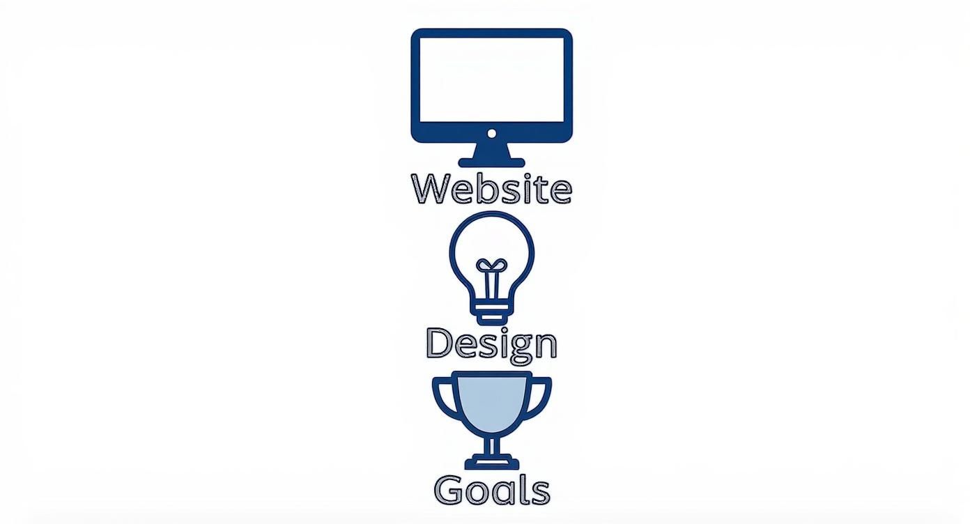
As you can see, strong design isn’t just for show; it’s the bridge connecting what people see on your site to the real-world results you want.
Painting a Picture with Colour
Colour is easily one of the most powerful tools in your design kit. It’s emotional. It’s memorable. The colours you choose can make someone feel calm, excited, or confident in what you offer. In fact, studies have shown that colour can boost brand recognition by up to 80%.
The key is to create a simple and consistent colour palette. This usually means picking a few primary colours that represent your brand and one or two accent colours to make important elements—like a "Book Now" button—pop.
A thoughtful colour palette does more than just decorate your site. It creates a cohesive experience that makes your brand instantly recognizable and helps build a genuine connection with your audience.
A consistent palette gives your website a professional, polished look. When someone lands on your homepage, they should get an immediate feel for your brand's personality, just from the colours alone. It's a subtle but incredibly effective way to build your identity without saying a single word.
Guiding the Eye with Layout and Hierarchy
Finally, let's talk about layout. This is all about how you arrange the text, images, and buttons on the page. A good layout is a carefully planned roadmap that guides a visitor's eye exactly where you want it to go. We call this visual hierarchy.
It boils down to making the most important things stand out. Your headline should be the biggest and boldest text. Your call-to-action button should be impossible to miss. Your services should be organized logically.
Imagine walking into a messy, cluttered shop. You wouldn't know where to look first, and you’d probably just turn around and walk out. A website is no different. A clean, logical layout helps people find what they need quickly, without having to think too hard about it.
Many of these ideas are adaptations of classic design principles that have been around for decades. What works on a printed page, however, needs a new approach for an interactive screen.
Print Design vs Web Design Principles
The table below shows how some timeless design rules are reimagined for the web.
| Design Principle | How It Works in Print | How It Works on the Web |
|---|---|---|
| Hierarchy | Static and fixed. Big headlines, subheadings, and body text guide the reader through a set path. | Interactive and dynamic. Elements like clickable buttons, hover effects, and font size guide users through tasks. |
| Balance | Symmetrical or asymmetrical layouts create visual stability on a finite canvas (the page). | Must be responsive. The layout needs to remain balanced and functional across different screen sizes, from a phone to a desktop. |
| Contrast | Uses colour, size, and shape to make elements stand out and create focal points on paper. | Crucial for accessibility (e.g., text vs. background colour) and for highlighting interactive elements like links and buttons. |
| Repetition | Creates consistency through repeating logos, colour schemes, and font styles across a brochure or magazine. | Builds brand identity and user intuition. Consistent navigation, button styles, and footers make the site predictable and easy to use. |
| White Space | The empty space on a page that prevents a cluttered feel and improves readability. | "Negative space" is essential for reducing cognitive load, improving focus on key content, and creating a clean, modern aesthetic. |
While the core concepts are the same, the execution changes because a website is an interactive experience.
When these three building blocks—typography, colour, and layout—work together seamlessly, they create an experience that feels effortless for your visitors. It’s this thoughtful combination that transforms a simple website into a powerful business tool. If you feel like your site’s foundation is a bit shaky, a professional partner can help you rebuild it the right way.
Making Your Design Work on Every Screen
Ever pulled up a website on your phone, ready to buy something, only to be forced to pinch, zoom, and scroll sideways just to read a single sentence? It’s an instant deal-breaker. You likely just gave up and found someone else. I know I have.
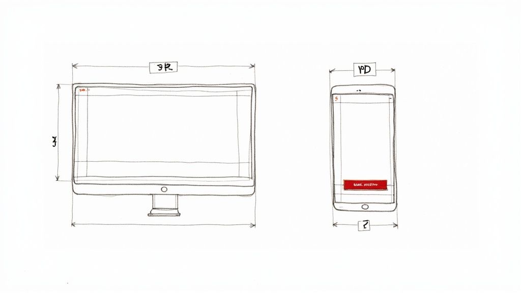
This experience is a massive problem for any business. Your website needs to look and feel fantastic everywhere—from a massive desktop monitor in a West Kelowna office to a tiny smartphone screen on a patio in Penticton. This is exactly what responsive web design solves.
What Is Responsive Design, Anyway?
Here’s a simple way to think about it: imagine your website's content is like water. A responsive design creates a container that allows the water to perfectly fill any shape it's poured into, whether that's a tall, skinny glass (a phone) or a wide, shallow bowl (a desktop).
This doesn't mean building separate websites for every device—that would be a maintenance nightmare. A responsive site uses a clever, flexible grid that automatically senses the screen's dimensions and reshuffles the content to fit perfectly.
That means text is always easy to read, buttons are large enough to tap, and images resize beautifully without any of that frustrating pinching and zooming. For a much deeper dive, you can read our guide on responsive web design.
Why This Is Non-Negotiable For Your Business
Today, having a responsive website isn't just a nice-to-have; it's essential. More than half of all web traffic now comes from mobile devices. If your site isn’t mobile-friendly, you're effectively putting up a "Closed" sign for a huge slice of your potential customers.
Here's why this is so critical:
-
A Better Experience for Everyone: A seamless experience on any device keeps visitors happy. Happy visitors are far more likely to stick around, understand what you offer, and ultimately become customers.
-
A Big Boost for Local SEO: Google knows just how many people are searching on their phones. Because of this, its algorithm prioritizes mobile-friendly websites in search results. A responsive site can directly help you rank higher when local customers are looking for your services.
-
It Saves You Time and Headaches: Managing one website that works everywhere is vastly more efficient than juggling separate desktop and mobile versions. It simplifies everything from content updates to marketing campaigns.
A website that works beautifully on a phone isn't a luxury anymore; it’s the standard. It shows your customers that you care about their experience and have invested in making their interaction with you as easy as possible.
Speed Matters More Than You Think
A crucial part of great graphic design for the web on mobile is speed. A responsive layout is the first step, but how fast that layout loads is just as important. Mobile users are often on the go and have zero patience for slow-loading pages.
The numbers are pretty stark. More than 50% of U.S. mobile users will abandon a website if it takes longer than three seconds to load. When you consider that mobile e-commerce now accounts for over 40% of total retail sales, it's clear that a fast, smooth mobile experience is essential for capturing those sales.
This is where a thoughtful design process really shines. It’s about optimizing images, streamlining code, and making sure every single element loads in a flash.
Ultimately, a responsive design respects your customer’s time and context. It meets them where they are, on whatever device they're using, and provides a smooth, professional experience that builds trust from the very first click.
Designing for Everyone with Accessibility
A truly great website is one that everyone can use. Simple as that. We're not talking about a complicated technical checklist or some buzzword to gloss over. It's about making your business welcoming to every potential customer, including the nearly one in four Canadians living with a disability.
Think of it like adding a wheelchair ramp to your brick-and-mortar shop in West Kelowna. You wouldn't want to turn away customers just because they couldn't get up the stairs, would you? Your website is no different. Making it accessible opens your digital doors to a much wider audience and sends a clear message that you care about every visitor's experience.
Practical First Steps for an Accessible Website
Diving into accessibility doesn't have to be some monumental task. In fact, many of the most impactful changes are really just fundamentals of thoughtful graphic design for the web.
Here are a few things that make a huge difference right away:
-
Mind your colours. Make sure there's enough contrast between your text and its background. This is a game-changer for people with low vision or colour blindness, making your content far easier to read.
-
Describe your images. Add simple, descriptive “alt text” to every image. This is what screen readers use to explain visuals to users who can't see them, ensuring they don't miss out on crucial context.
-
Design for keyboard navigation. Not everyone can use a mouse. A well-designed website allows users to move through every page, link, and form using only their keyboard.
These aren't just niche adjustments; they create a better, more intuitive experience for all your users. As a bonus, search engines like Google tend to favour accessible websites, which can give your SEO a nice little lift.
An accessible website is simply a well-designed website. It’s about creating a clear, simple, and intuitive experience that works for every person, every time.
Why This Is More Than Just a Good Idea
Being inclusive is the right thing to do, but let's be frank: it’s also just smart business. You immediately expand your potential customer base and build a reputation as a considerate, community-focused company. We've seen how focusing on accessibility improves engagement firsthand, especially within the Okanagan's diverse tourism sector. You can read more about our approach to improving website accessibility for that industry right here.
Beyond the ethical and business upsides, there are growing legal reasons to pay attention. The web is increasingly being treated like a public space, and that comes with certain responsibilities. To put it in perspective, in 2024 alone, over 4,000 ADA-related digital lawsuits were filed in the United States, a clear signal of how seriously this is being taken.
Building accessibility into your website from day one is always the best path forward. It means you’re not just avoiding future headaches but actively creating a better, more welcoming online space for the entire community. If it all feels a bit overwhelming, just remember that a good web design partner will treat this as a core part of their process, not just an add-on.
Optimizing Images and Graphics for Speed
So, you've got a folder full of stunning, high-resolution photos ready for your new website. That’s fantastic! But here’s a classic pitfall we see all the time: those beautiful, massive image files can slow your website down to a crawl. And let's be honest, nobody in Kelowna—or anywhere else—is going to stick around for a page that takes forever to load.
The good news? You can absolutely have the best of both worlds. It’s entirely possible to feature crisp, professional visuals that load in a flash. The secret lies in a few simple image optimization techniques.
Think of it like packing for a trip. You want to bring all your favourite outfits, but you also need the suitcase to be light enough to carry. Optimizing your images is the same concept—we’re making them lighter and more efficient without sacrificing their quality. A faster website leads to happier visitors, and that’s a big win in Google’s eyes.
Choosing the Right File Type
First things first, not all image formats are created equal. A huge part of effective graphic design for the web is simply using the right file type for the right job. You'll mainly be working with three contenders.
-
JPEG (or .jpg): This is your workhorse for photographs. JPEGs are brilliant at handling the millions of colours you'd find in a picture of the Okanagan Lake at sunset. They can be compressed significantly to reduce their file size without looking noticeably worse.
-
PNG (or .png): Reach for a PNG when you're working with graphics that have flat areas of colour, like your company logo. They're also your only choice if you need a transparent background. PNGs keep lines and text looking sharp, but be warned—using them for complex photos will result in very large files.
-
SVG (or .svg): This one is special. SVGs aren't made of pixels; they're made of code. This makes them perfect for logos, icons, and simple illustrations. The real magic is that you can scale an SVG to any size, from a tiny favicon to a massive billboard, and it will never, ever get blurry. Plus, their file sizes are usually minuscule.
Just picking the right format from the get-go can have a massive impact on your site’s performance.
The Gentle Art of Compression
Once you have the right file type, the next step is compression. This is just a fancy word for using a tool to shrink the image's file size. There are tons of great, free online tools that handle this beautifully, or you can do it right inside professional software like Adobe Photoshop.
The trick is to find the sweet spot: the file size is as small as possible, but the image still looks sharp and clear to the human eye. You don't want to overdo it and end up with a pixelated, blurry mess.
A fast website isn’t just a technical nicety; it’s a core part of the customer experience. Optimizing your graphics shows visitors you respect their time, which is the first step in building trust.
Making sure a website is fast and efficient is a cornerstone of the web design industry, which is a surprisingly huge field. To put it in perspective, the U.S. web design industry generated $43.5 billion in revenue in 2024, with top designers in tech hubs earning well into six figures. It just goes to show how much businesses value a high-performing, professionally built website.
Ultimately, a fast site is a successful site. Every millisecond counts, and your images are one of the biggest factors you can control. If you’re curious about your own site’s performance, you might want to look into understanding website speed and how it impacts your online success. It’s a crucial piece of the puzzle.
Tying It All Together
We’ve covered a lot of ground, haven't we? From the foundational principles of good design to making sure your site looks great on a phone and loads in a flash. Now, let’s bring it all home and connect these ideas to what truly counts: your business goals.
When all these elements—the visuals, the responsiveness, the performance—work in harmony, your website becomes more than just an online brochure. It evolves into a powerful tool that builds credibility and works tirelessly for you, 24/7.
The goal is to make it incredibly easy for visitors to take that next step, whether that’s calling your office, filling out a form, or clicking "buy now". Great design makes that path obvious and inviting.
Your Website Should Be Your Best Salesperson
Take a hard look at your current website. Do you feel a bit underwhelmed by its performance? If it’s not bringing in the leads or sales you expected, that’s a clear signal something is off. The design might look nice, but maybe it isn't aligned with your business objectives.
This is a common frustration we hear from business owners right here in the Okanagan. You’ve put your resources into a website, but it feels like it's just occupying a corner of the internet instead of actively contributing to your bottom line.
At Navigator Multimedia, we believe a website’s primary job is to drive real, measurable results. We partner with local businesses to build websites that don’t just look good—they're engineered from day one to achieve specific, tangible goals.
It's about a strategic partnership. We get in the trenches with you to understand your business inside and out. From there, we build a website that functions as a genuine asset, one that actively helps you grow.
If you’re ready to transform your website into your hardest-working employee, we're here to help you chart the course. Feel free to get in touch with our team for a no-pressure chat.
Common Questions About Web Graphic Design
We get it. Thinking about graphic design for your website can feel a bit overwhelming, and it usually brings up a lot of questions. We hear them all the time from business owners, so we wanted to tackle a few of the most common ones head-on.
Think of this as a quick chat to clear the air.
How Is Web Graphic Design Different From Print Design?
This is a great place to start. While both web and print design share fundamentals like colour theory and layout, how they're applied couldn't be more different. A brochure or a business card is a static object—once it’s printed, its job is done.
A website, on the other hand, is a living, breathing thing. It has to adapt. We need to consider how a design will look and feel on countless different screen sizes, from a tiny phone to a massive desktop monitor. We also have to think about practical things, like how quickly images load and how easy it is for a real person to tap a button or fill out a form.
We’re also juggling factors like accessibility for people using screen readers and search engine optimization (SEO), which don't really come into play with print. It’s like the difference between designing a beautiful poster for a building's grand opening versus drawing the actual blueprints for a functional, accessible building.
How Much Does Professional Web Design Cost a Small Business?
This is easily the most popular question we get, and for good reason. The honest answer? It depends. Much like building a house, the final cost hinges on the size and complexity of the project.
A simple, clean website built on a solid template will be a smaller investment. If you're looking for a completely custom-built site with e-commerce, booking systems, or unique animations, that will naturally require a larger budget.
At Navigator, we believe in being completely transparent about costs. The best way to get a real number is to just have a conversation. We’ll learn about your business, your customers, and what you need your website to actually do. From there, we can map out a clear investment and find a solution that fits your goals.
Can I Do My Own Web Design With Tools Like Canva?
Absolutely! Tools like Canva are fantastic for creating quick social media posts, simple flyers, or blog graphics. We even use them ourselves for certain tasks. They’re brilliant for your day-to-day marketing visuals.
But designing an entire website is a different ballgame. A professional web designer is architecting the entire user journey, from the first click to the final sale. They’re thinking about technical performance, SEO structure, and how everything responds on every possible device. They build the strategic foundation that turns a collection of pages into an effective business tool.
So while you can certainly create some great-looking graphics with these tools, partnering with a pro ensures the final website is a hardworking asset that actually grows your business.
If you're ready to build a website that doesn't just look good but also drives real growth for your business, the team at Navigator Multimedia is here to help. Let's have a chat about what's possible.