Memorable User Experiences with Minimalist Web Design
The confines of restraint test our creativity in ways that often result in memorable experiences. Stripping a web design down to its essential elements can provide users with focused access to what they want to accomplish, and what you wish for them to discover. Minimalist web design is not a trend. It is a movement for effective communication.
Smashing Magazine contributor Cameron Chapman says that minimalism is all about “taking things away until nothing else can be removed with interfering with the purpose of the design.”
That might sound too simple, but consider what stays behind in the process. With fewer elements gracing the page, every decision must be considered strategically. Typography, placement of text, shading palettes and white space, will be subject to vulnerability. With minimalism, every choice is bold.
So when considering minimalist web design for your own site, think about what must remain on the page, and what is non-essential for the optimal user experience of your content.
Delwin Campbell of SixRevisions.com suggests that we keep three elements in mind:
- Subject
- Usability
- Balance
The subject of the page-the most vital element in your business communication-should be maintained in minimalist design. This directs users to accomplish tasks and learn about your services. Anything outside these goals need not be included.
Only include elements that improve usability, and enhance user-friendliness. Clarity in instructions is key. Don’t strip the design down to the point of confusion, where functions have no explanations, or the page lacks user direction.
Visual hierarchy matters in minimalist web design, making balance necessary for effective white space. When the user hits your homepage, what elements are they immediately drawn to? What do you want them to see first, and how will they roam the page?
Strategic colour usage, typography choices, and placement of content must be thought out with subject, usability, and balance considered. Careful planning in minimalist design sets the dynamic web solutions apart from the bland, white space layouts that are simply grasping at the aesthetic lure.
While minimalist web design does make for clean, impressive layouts, the benefits in enhancing user experience greatly outpace the superficial visual aspect.
Take a look at some of these minimalist design galleries to assess whether minimalism is a direction for your business website to consider. Minimalism can create memories.
Vandelay Design: Beautiful Minimalist Websites
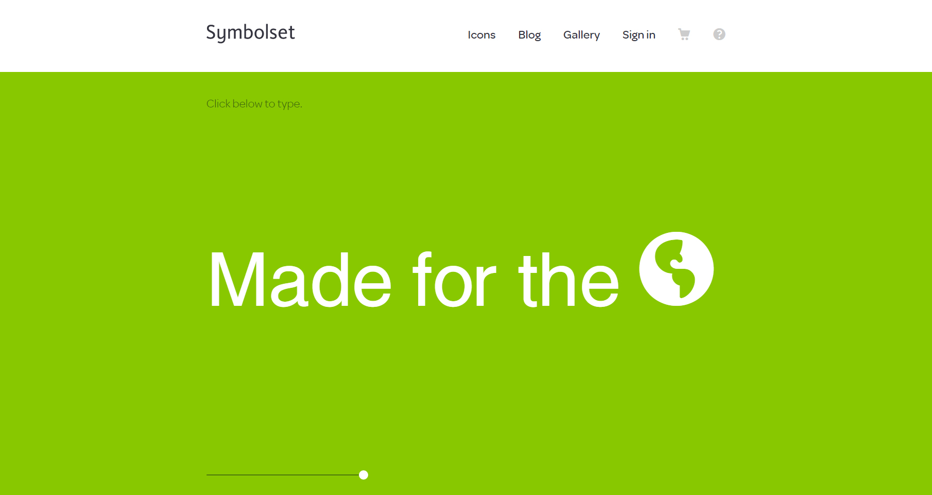
From this list we liked Symbolset’s use of full-width, solid color design.
CSSDSGN: Minimalist Sites
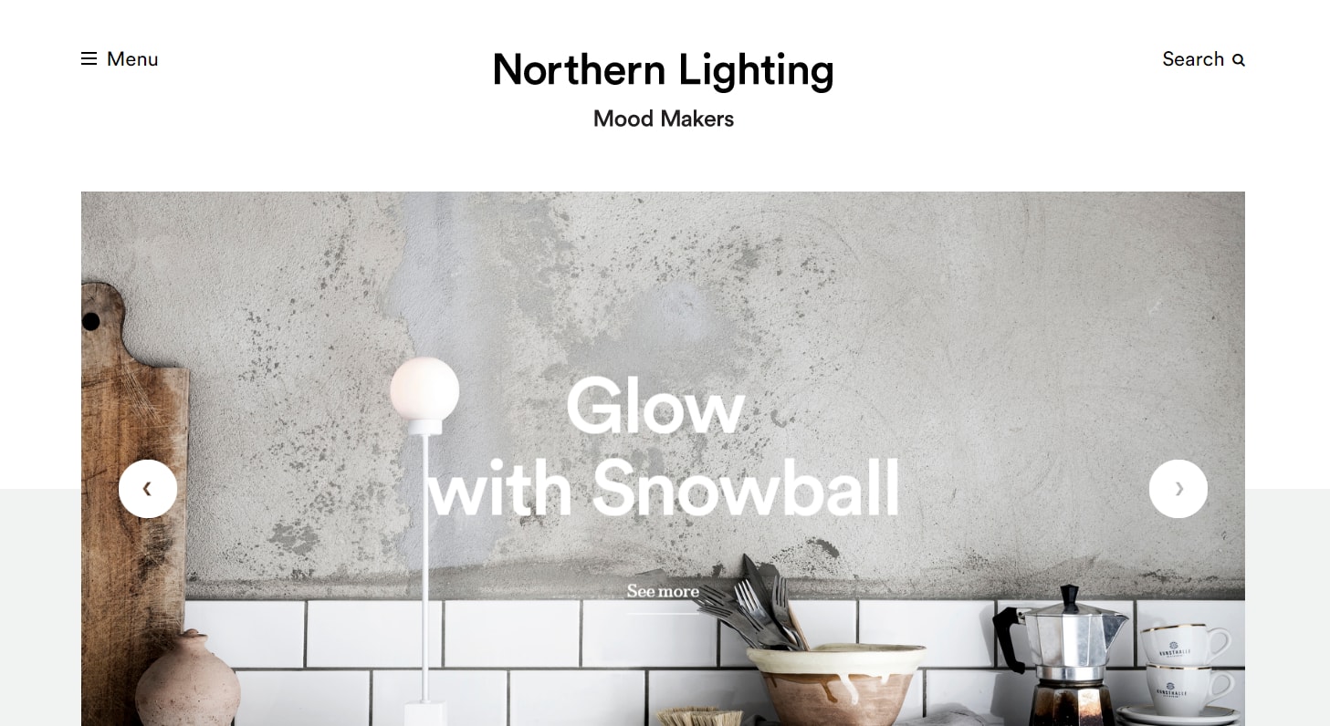
From this list we liked Northern Lighting’s use of spacing, imagery, and colour.
Minimal Exhibit: Minimalist Web Design Gallery
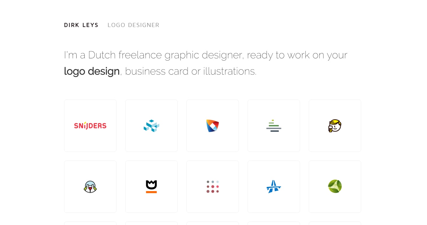
From this list we liked Dirk Leys‘ icon layout with lots of white space.
Awwwards: Minimal Websites
From this list we liked Seedlip’s centered design, with great use of depth and color tone.
TheNextWeb: 7 pillars of minimalist Web design
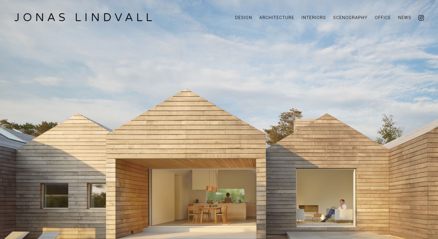
From this list we liked Jonas Lindvall’s use of simplistic full-width imagery that draws your eyes to the people.
Got minimal website examples you like? Share them in our comments section below!
See Also
A Love Letter To Big Photography In Web Design
5 Street-Smart Questions to Ask Before Hiring a Web Designer
References
Campbell, Delwin. “How Minimal is Too Minimal?” 5 December 2011. SixRevisions.com: http://sixrevisions.com/web_design/minimalist-how-minimal/
Chapman, Cameron. “Principles of Minimalist Web Design, With Examples.” 13 May 2010. Smashing Magazine: http://www.smashingmagazine.com/2010/05/principles-of-minimalist-web-design-with-examples/


10
Ja
"Appreciate you sharing, great post.Really thank you! Fantastic."
Mindy
I appreciate you sharing this article post.Much thanks again. Awesome.
Otha
I appreciate you sharing this article post. Keep writing.
Sarah Bauer
Thank you for the positive feedback! Is anyone considering a minimalist redesign for their own site?