The Top 3 Takeaways From Canada’s Best Digital Marketing Conference
Conferences we attend for work can often be dull affairs. Luckily that wasn’t the case with the Call-To-Action (#CTAConf) conference we attended in Vancouver this June. While it was lighthearted and fun enough that non-marketers would have had a great time, it was also jammed full of great information for those of us in the digital trenches looking for new insights and understanding of the industry as a whole. These are the top 3 things we took away from our time spent at CTAConf that we wanted to share.
1. Remember There’s A Human Behind Each Screen
It’s easy to get lost in the numbers, graphs, charts, and percentage figures that stare back at us through our screens every day. Our thirst for data is insatiable, and it’s a good thing when there are goals and missions to achieve. However, as powerful as that data is, it’s necessary to remember that it’s the direct result of a human doing things willfully with their eyes, brains, and hands behind a screen.

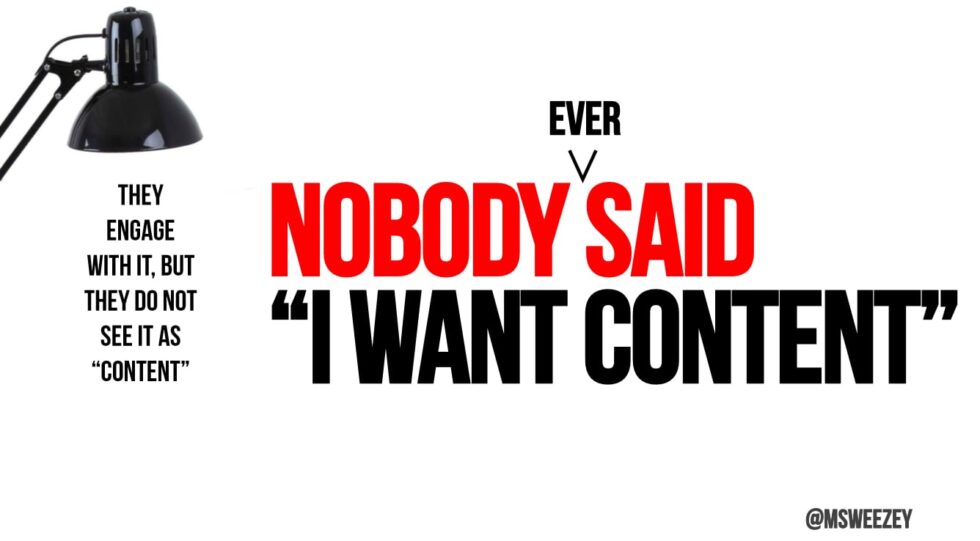
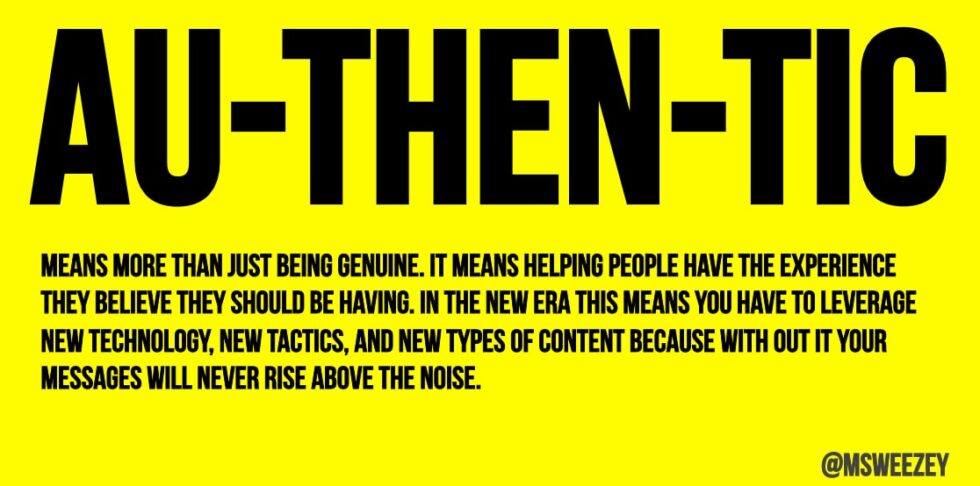
Matthew Sweezy argued the importance of creating authentic experiences. We’re exposed to more screens, more communication mediums, and more noise now than at any time in history. And, almost ridiculously, there’s no end in sight of the upward trend for each of those. As a result we’re becoming a lot more selective about what we focus brain power on, and what we ignore and block out.
Therefore, creating experiences that are real, unique, and leave lasting impressions is key when trying to stand out. It doesn’t make sense to follow the crowd when you’re capable of doing what others can’t or won’t. The one theme that was touched on by many CTAConf presenters was both a simple and powerful one: give people what they want.

2. “Stop Making My Brain Hurt”
Michael Aagaard in his presentation argued our brains have 2 systems for thinking:
- Intuitive thought, where the brain acts as a “machine for jumping to conclusions” – the autopilot-like state our brains spend most of their time in (and prefer to be in!), and
- Analytic thought, where the brain acts as a “lazy controller” – it has so much power to think about something and solve problems, but it will try to minimize the workload to avoid that unpleasant ‘Brain-Hurting’ feeling
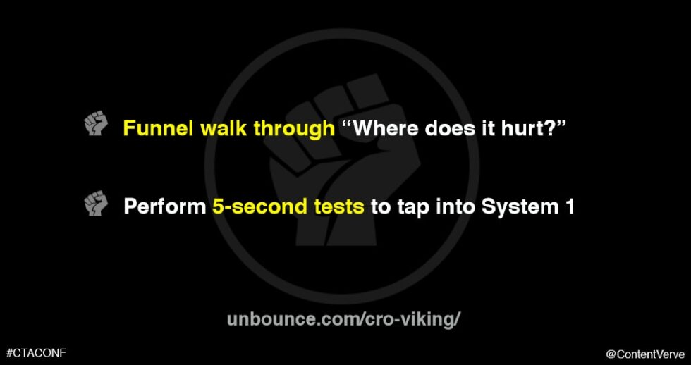
He spent his time emphasizing why and how we should cater to the intuitive system of brain-thinking. We all know the feeling of mental frustration that occurs when things aren’t intuitive. Creators, who know their stuff inside and out, often put so much analytical thought into what they are making that intuition is overlooked. Michael offered 2 great suggestions for testing intuitiveness on a website:

First, he tells us to actually go through the website’s purchase funnel. Simple enough right? Many businesspeople who have a sales funnel on their website haven’t actually tried to make a purchase on it themselves. Go start-to-finish through that process and ask, “Where does it hurt my brain when I try to use this?”. Wherever you find that happening there’s a good chance its contributed to purchase abandonment.
Secondly, he brings up a great way to tell if a website is communicating its message intuitively: with 5-Second Tests. To do this test, simply pull up a page, look at it for 5 seconds, and close it. If you can’t tell what it’s about in that short time, there’s either too much information on that page or the messaging is too vague. Get multiple people who haven’t seen the page before perform the test. See what their answers are when asked “What was that page about”?. If the results are poor, make changes that clarify the page’s offer and try again. Often tweaking the main heading text alone can significantly reduce the number of “I don’t know” answers. Eliminate the Brain Hurt your site is causing by being unclear and your users can move on to purchase consideration that much faster and happier.
3. Poomoji’s Have Insane Marketing Power
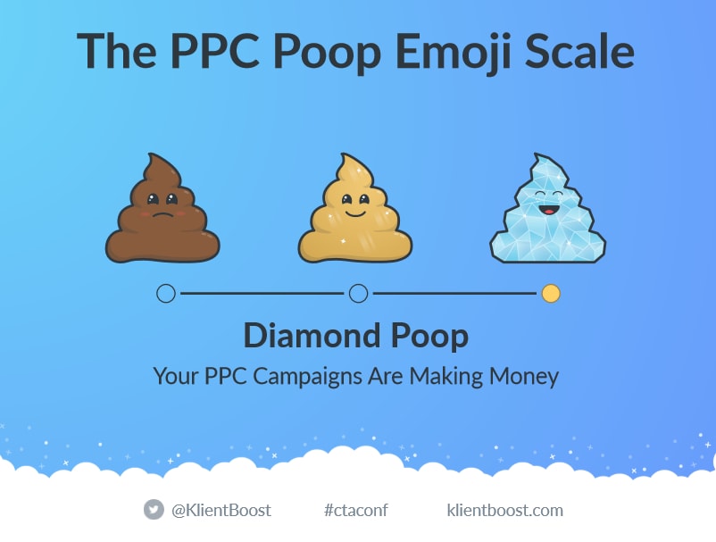
One of the most memorable presentations this year discussed measuring efforts in PPC advertising, structured around a “Poomoji Scale”. The scale with 3 custom Poomojis representing Good, Better, and Best immediately caught the audience’s attention and effectively organized the presenter’s content. At the end, he pulled an Oprah on us and told us to look under our seats. Everyone in the audience received a packet with a high quality sticker of each Poomoji, drawing major laughs and applause.

The success of this presentation goes back to our other two takeaways. Because the content was well organized and accompanied with an intuitive graphical scale (Poomojis), our brains didn’t hurt. The mechanics behind PPC advertising forces our brains into analytic thinking mode, so to not be mentally forced into our computer chairs was a pleasant treat.
The content was created for us as people, not button-pushing lever-pulling drones. People like to laugh, poke fun, and sometimes be a little immature – I think that’s why the original poomoji can be found in the recently used list on a lot of our phones. The Poomoji scale was a unique use of something both familiar and popular. The Oprah-style move at the end added the elements of surprise and delight. It’s guaranteed the stickers will end up on MacBooks worldwide, charming people who don’t know or care about PPC. All of these things combine to create a memorable experience compared to a regular ol’ presentation.

Leave a comment for us on Facebook or Twitter if you found this useful!


